TUrning patrick nagel paintings into a brand identity
Intro: Atlas Salon, an alternative hair studio in Chicago, IL, contracted me to help with their rebrand in an effort to develop a visual identity that felt more authentic and unique. It was important for the new brand to underscore Atlas' specialization in vivid dye jobs and communicate a welcoming atmosphere to a diversity of clients. This project involved end-to-end branding, from initial research and exploration through print production.
Skills/applications: Print design and production (services menu, posters), social media graphics, visual identity, logo design
Tools: InDesign, Photoshop, Illustrator, Procreate, Figma
The challenge
Atlas salon caters to members of the LGBT+ community and they specialize in vivid dye jobs. Their old brand, which heavily featured earth tones and script typefaces, did not reflect the Salon's personality, nor did it differentiate the business from competitors. Further, Atlas needed visual guidelines to help maintain a consistent brand as they scaled.
My challenge was to develop a new visual identity that established Atlas as a leader in vivid dye jobs while underscoring the Salon's values of acceptance and inclusion. I also needed to establish guidelines that would help anyone, from the owner to a future assistant, apply the brand across assets.
The RESULT
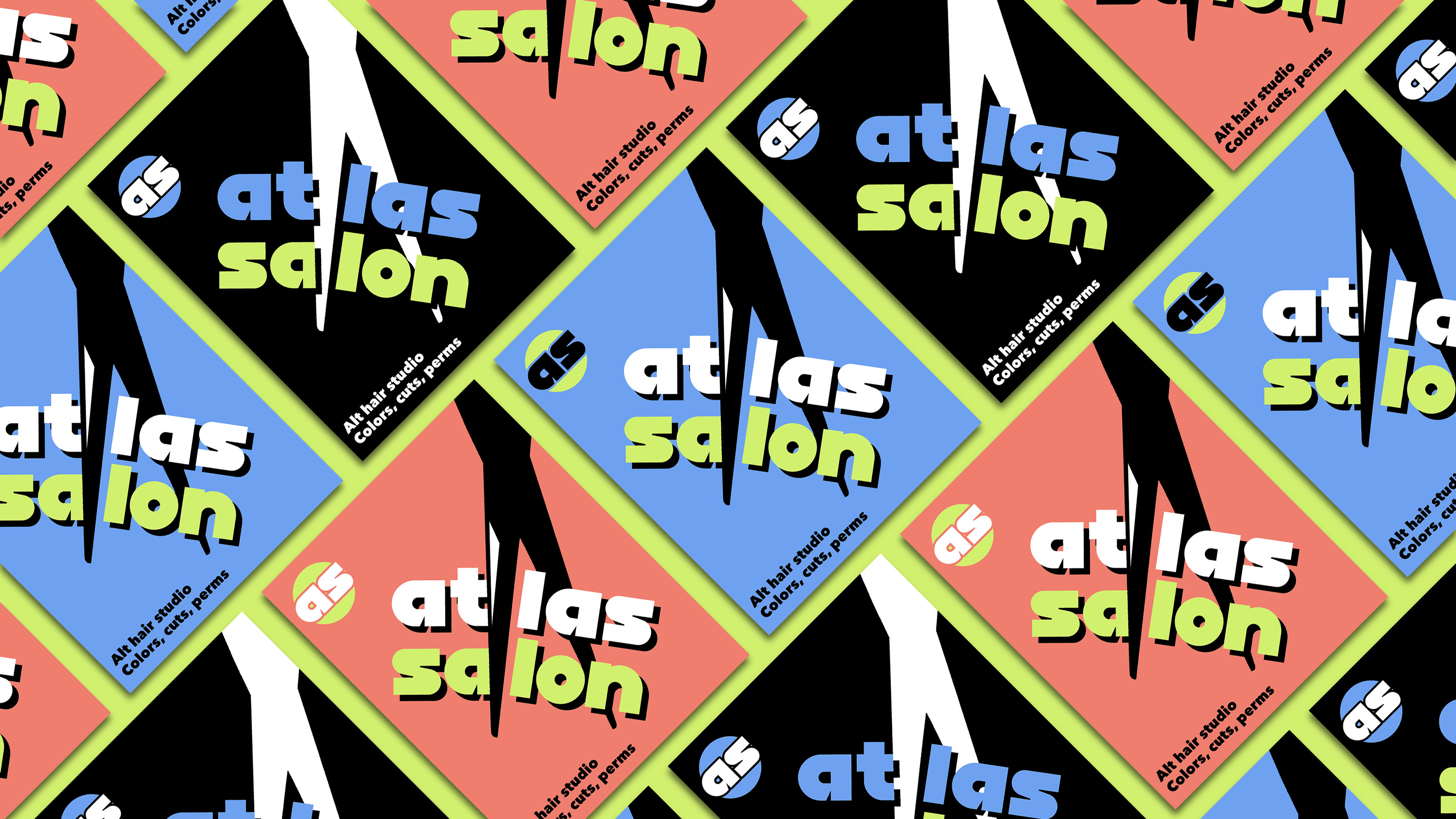
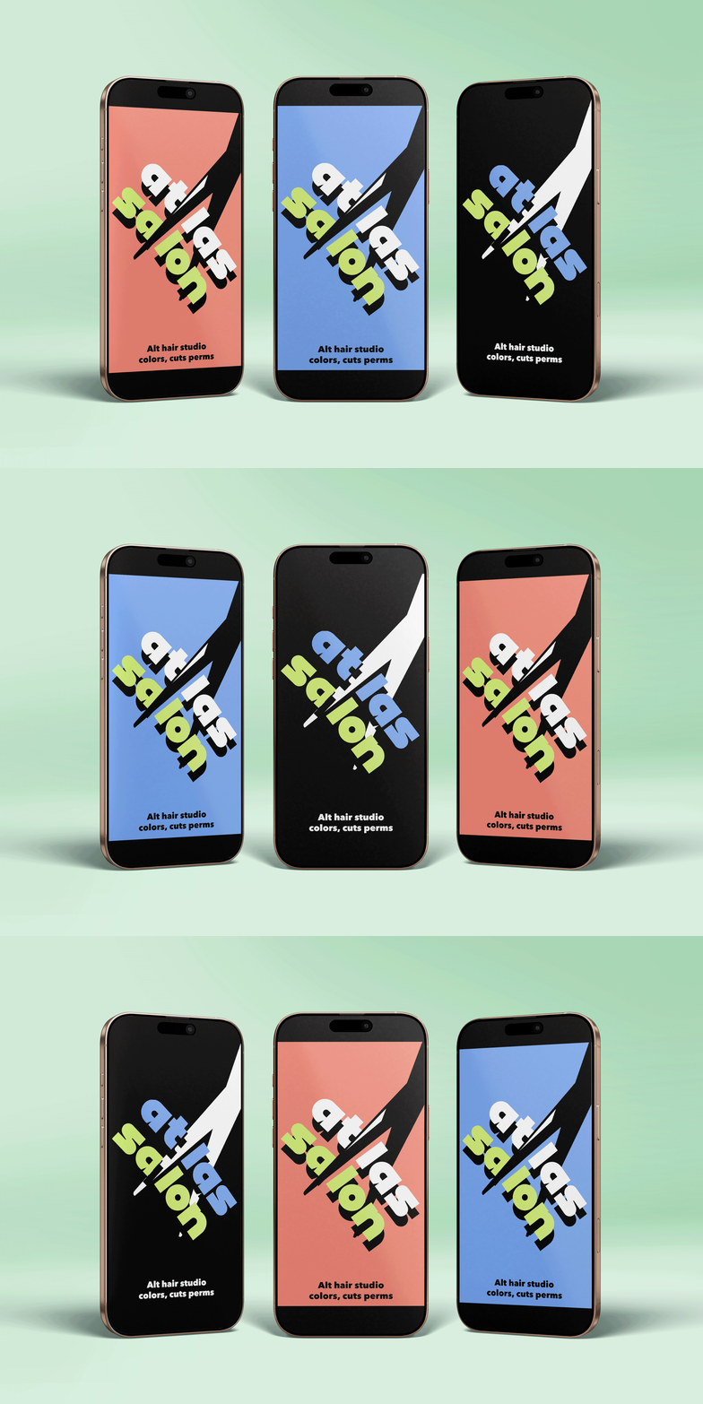
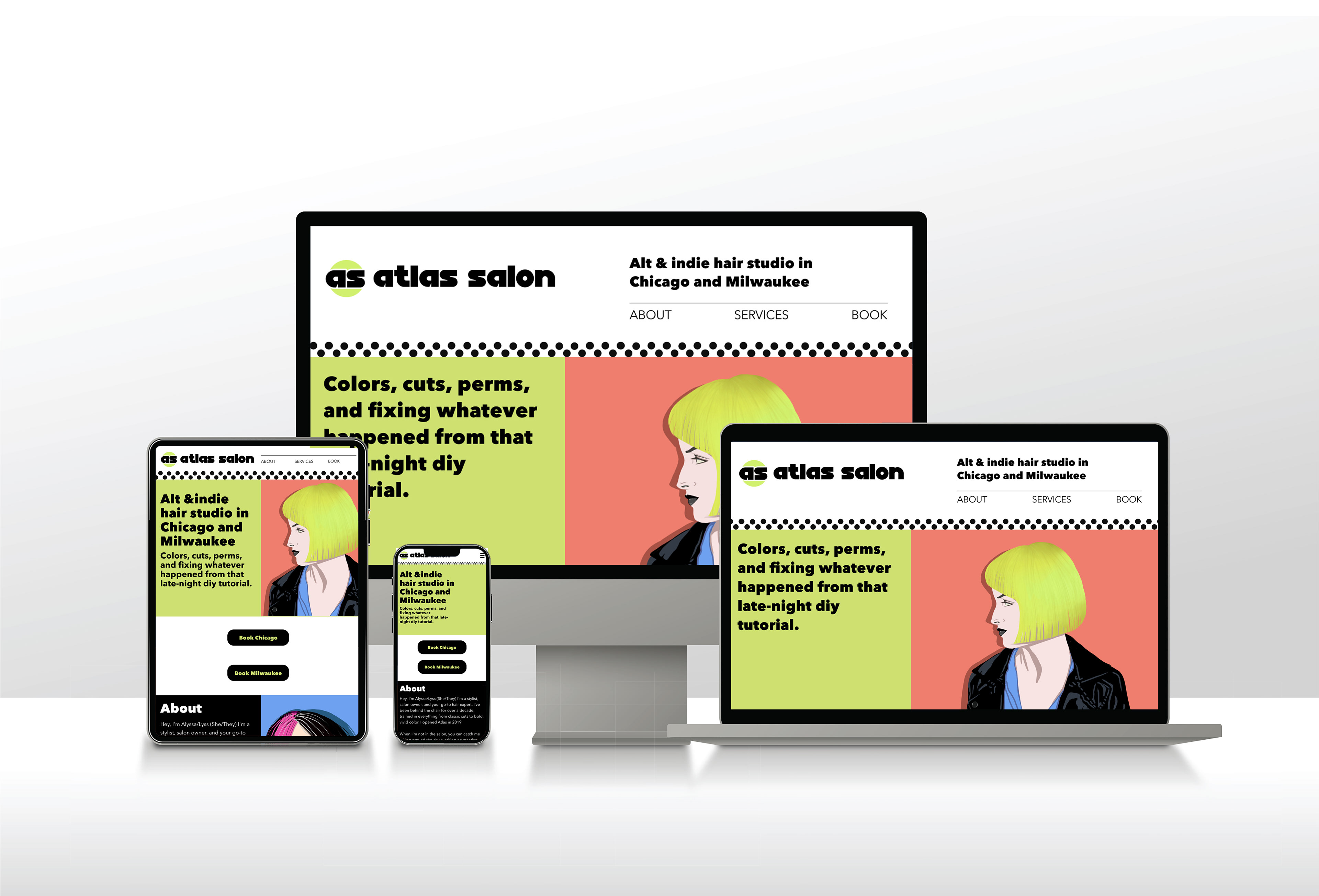
The new Atlas Salon brand is differentiated and reflective of what makes the business unique. Using real work from the Salon's portfolio as inspiration, the brand brings color to the forefront. Fresh typography and custom illustrations personalize the brand, setting Atlas apart from its myriad competitors.
Research
I began by sitting down with my client to understand her vision, needs, and goals. She expressed that she wanted a visual identity that felt welcoming to a diversity of clients, and that she was inspired by the globe (hence Atlas Salon), Memphis design, and Patrick Nagel's paintings. This conversation enabled me to put together a mood board, which I iterated on with my client. Our final mood board was my launchpad for establishing a visual direction.
After iterating on several design mockups and client personas, I began to pursue a visual identity built around circles and curvilinear shapes — based on the globe — and a colorway that marries vibrant dye-inspired hues with 1990s motifs.
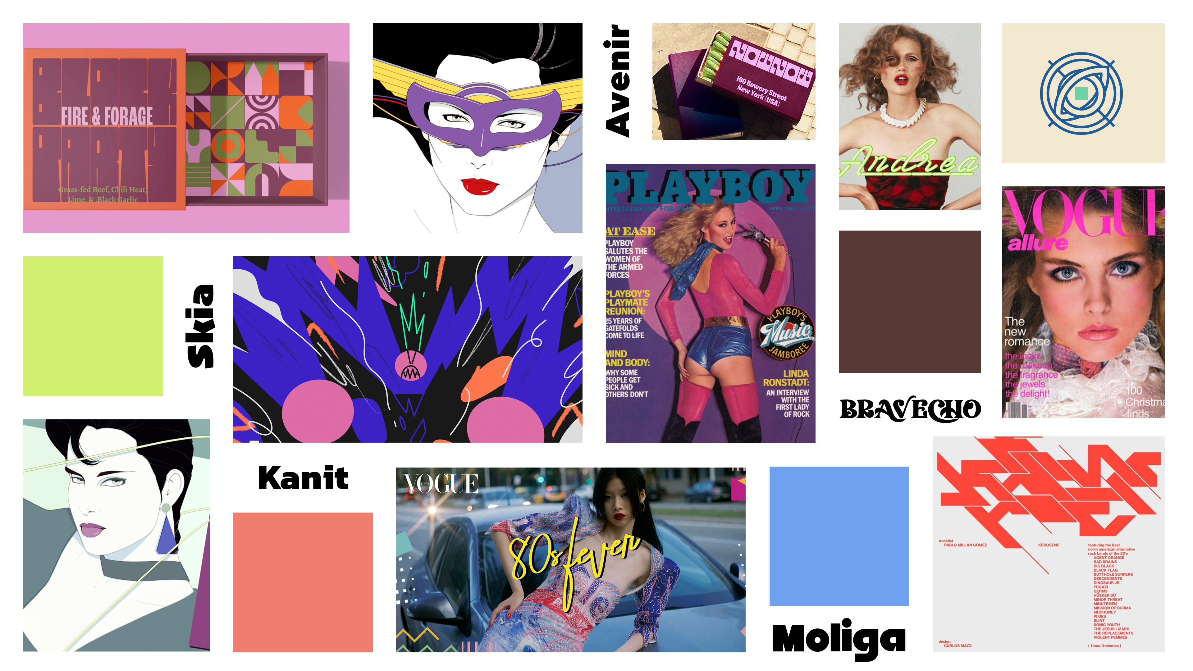
Mood board exploring Memphis design, Patrick Nagel's paintings, circular motifs, potential brand colors, and typefaces.
Typography
We opted for lowercase type in the brand logo to signify that Atlas Salon is a welcoming studio for people from all walks of life. The wordmark and logo use Moliga, a heavy typeface that reflects New Age trends of the 1980s. Moliga is a splasly typeface, so to offset it, I selected Avenir Next for text type. Together, the typography indicates a business with deep experience that's not afraid to push boundaries.
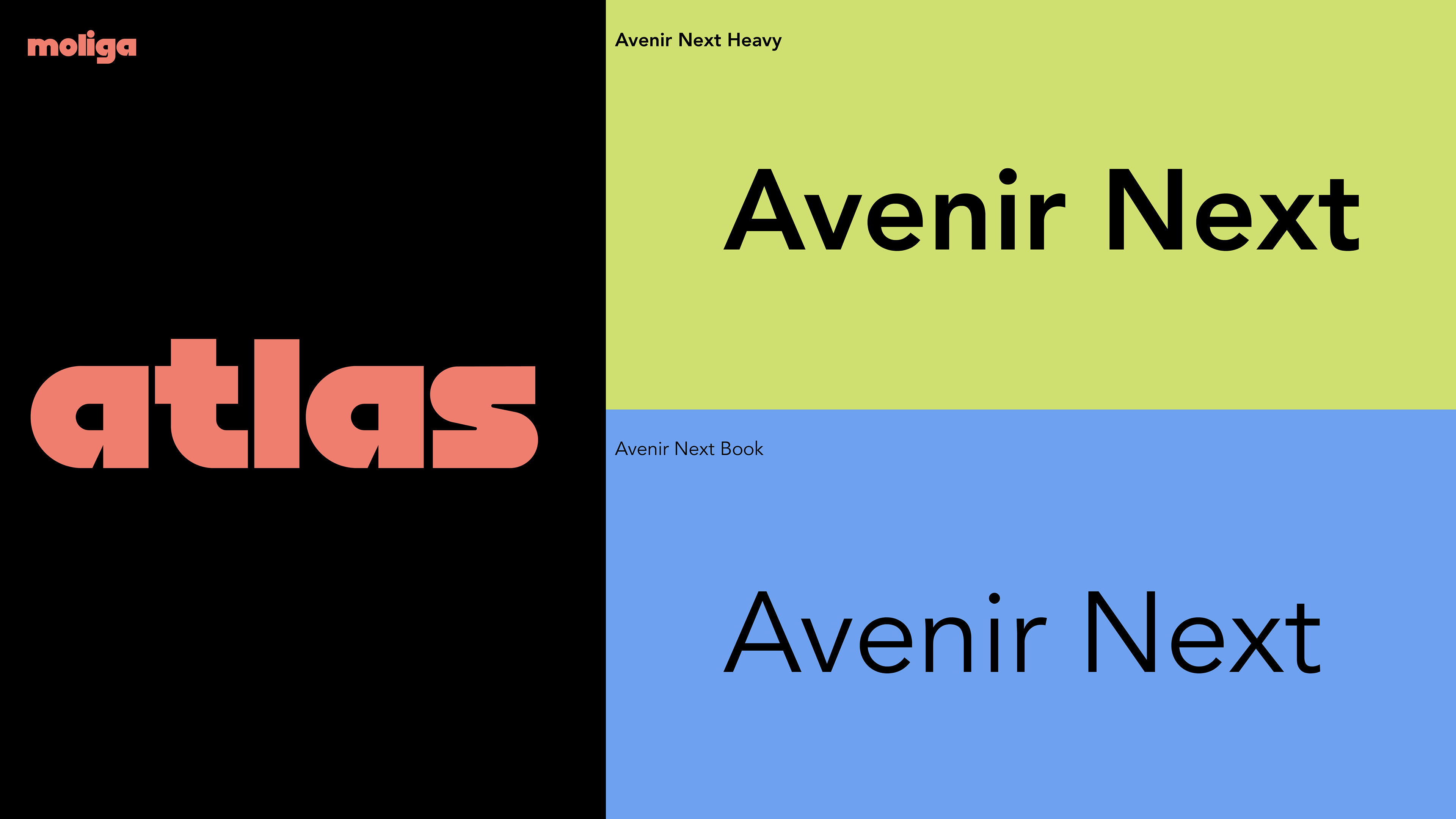
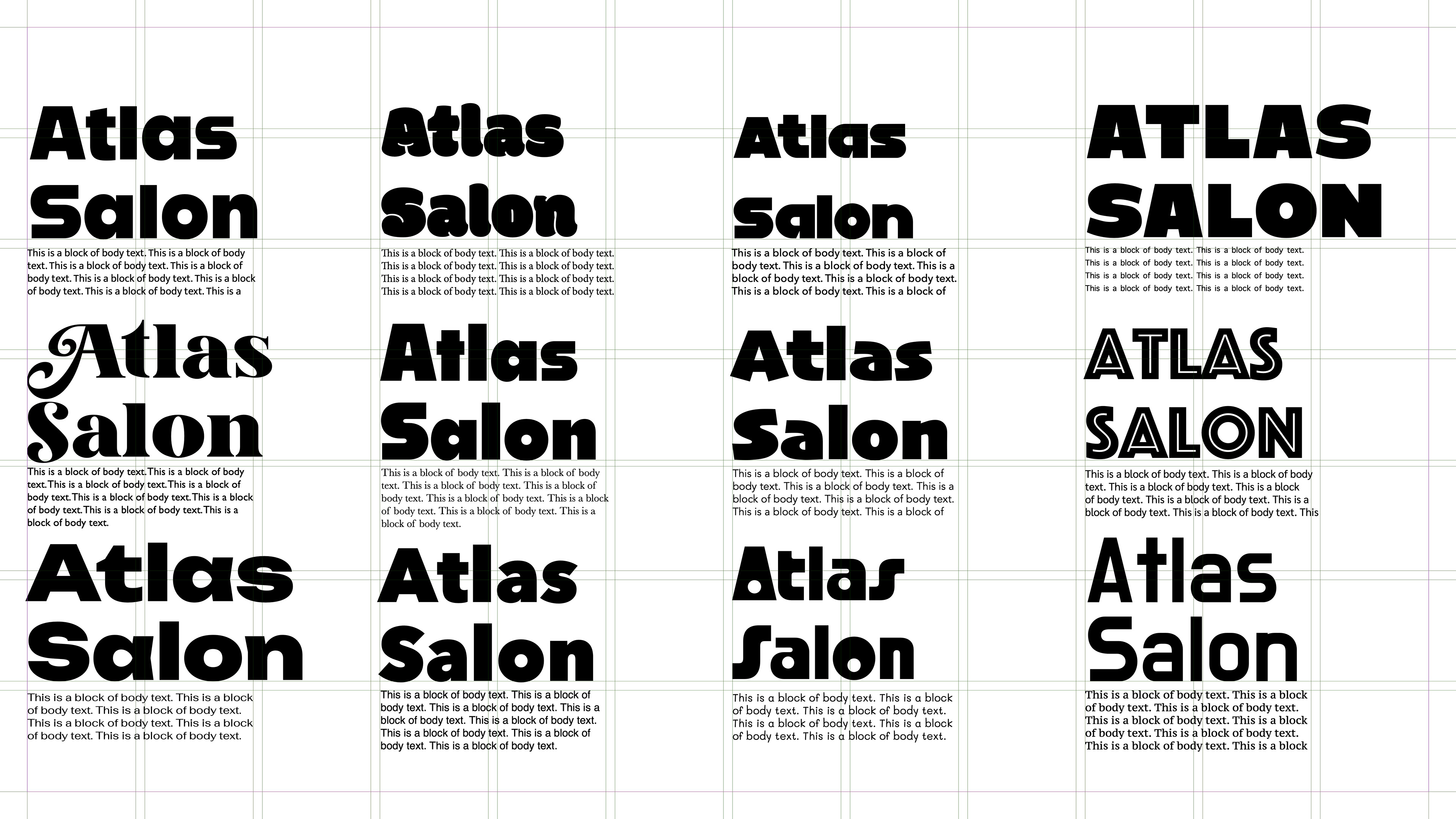
Typeface exploration
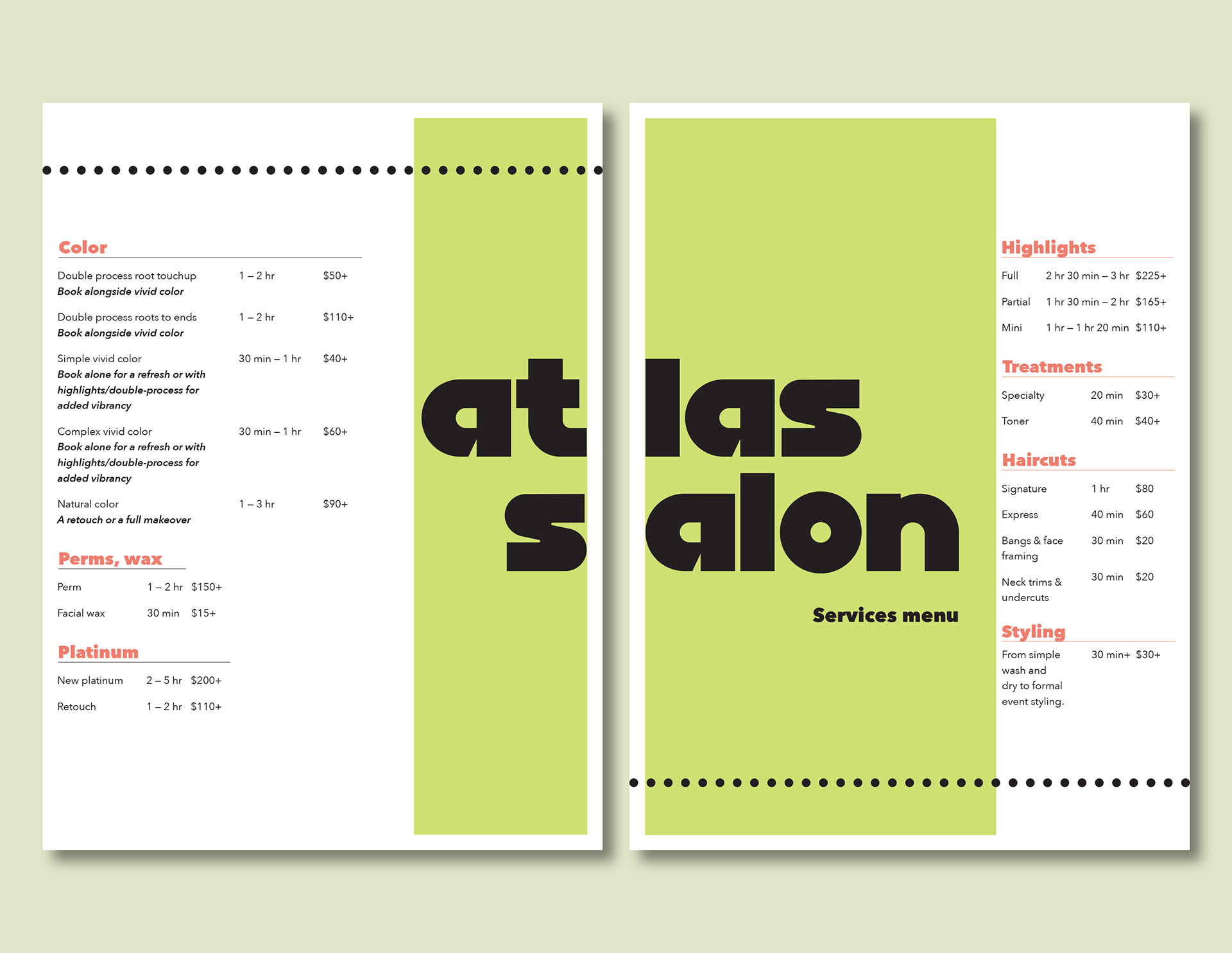
Final salon menu
COLOR
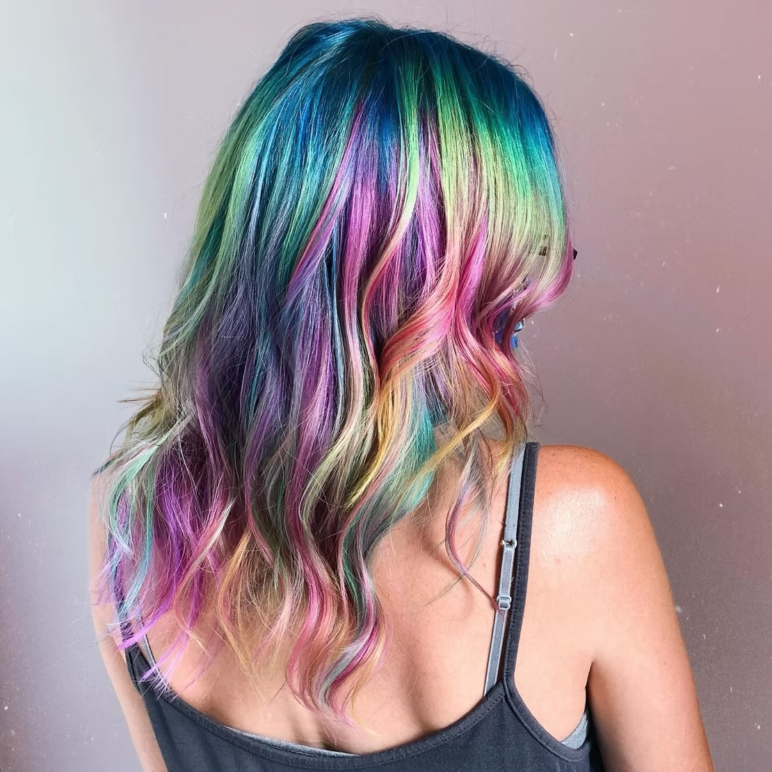
To determine Atlas' new colorway, I turned to their portfolio. One photo of a pastel dye job (center top below) particularly inspired me, and led me to pursue a colorway marrying ever-so-muted blue and red. A bright green rounds out the colorway, giving it an essential pop. When paired with black, the brand's colors deliver memorable visual impact.

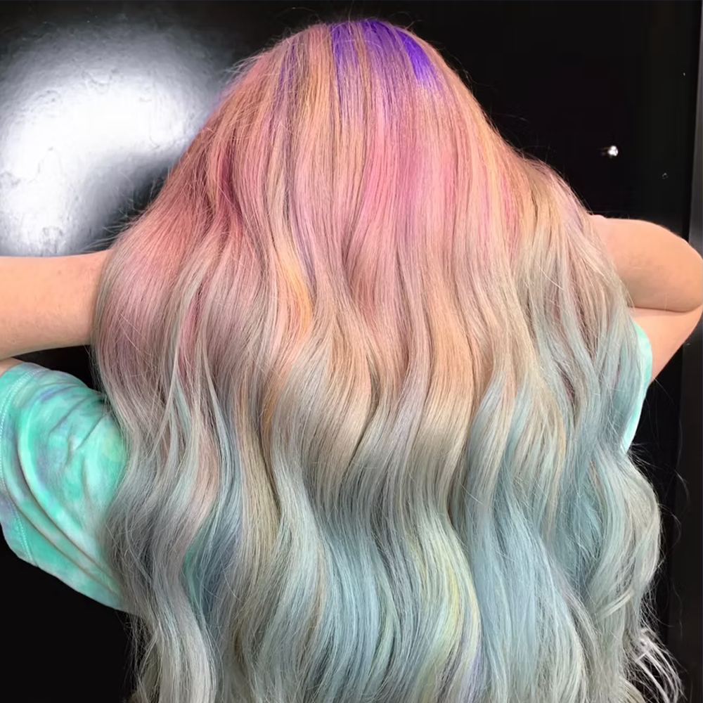

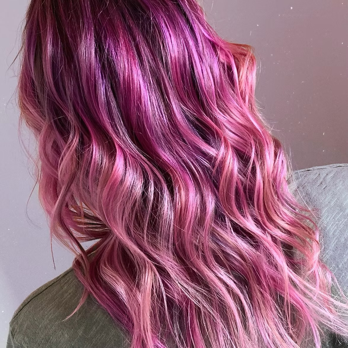

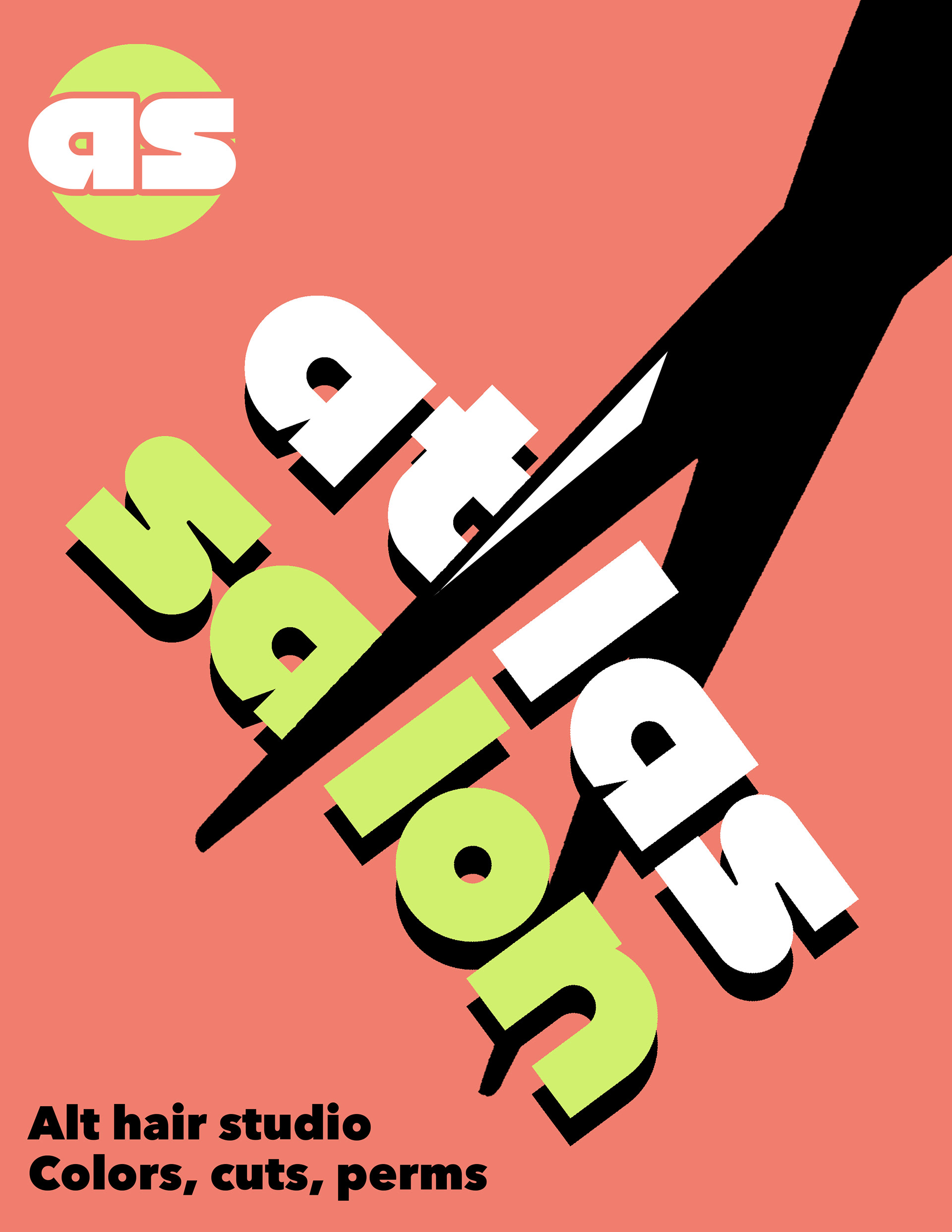
Social graphic - Illustrator and Photoshop
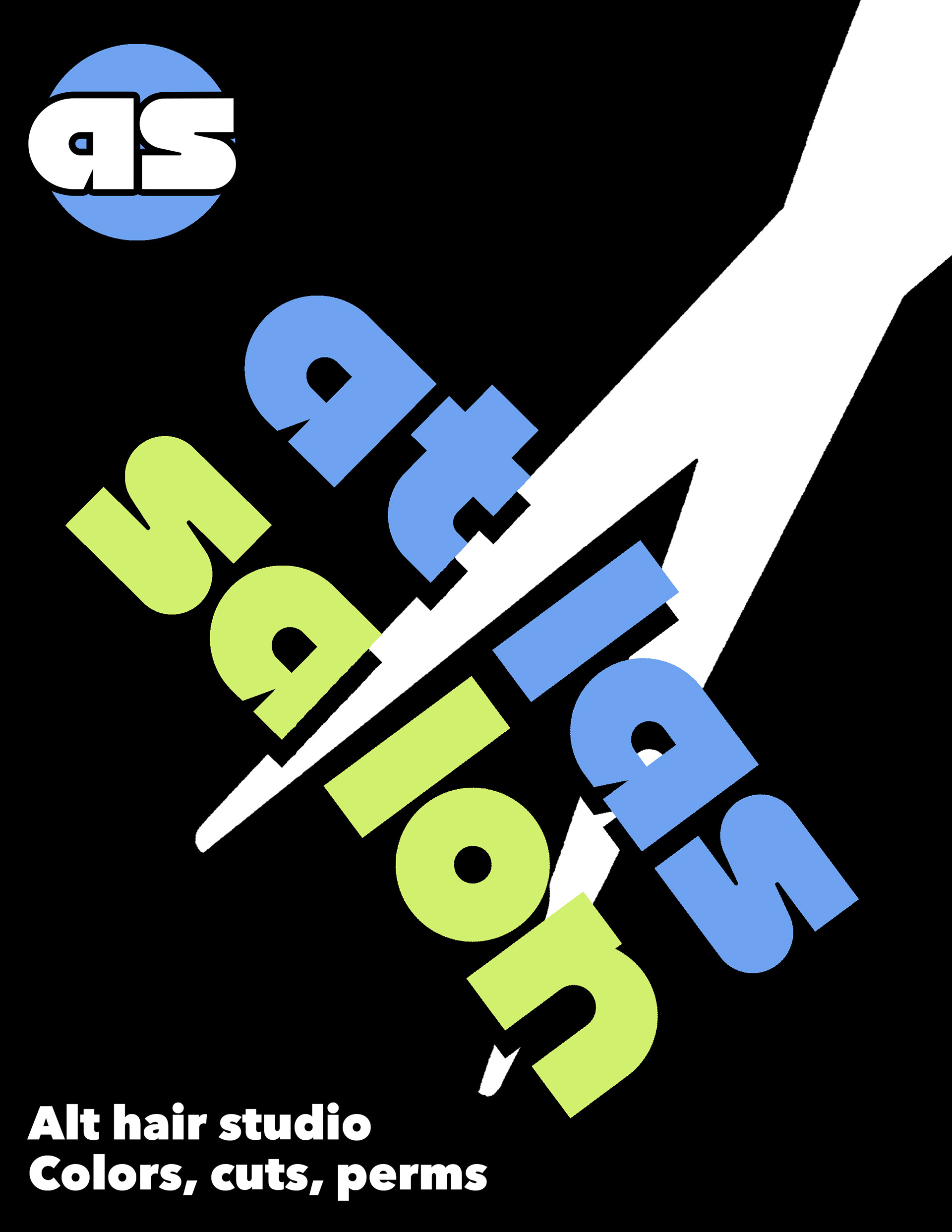
Social graphic - Illustrator and Photoshop
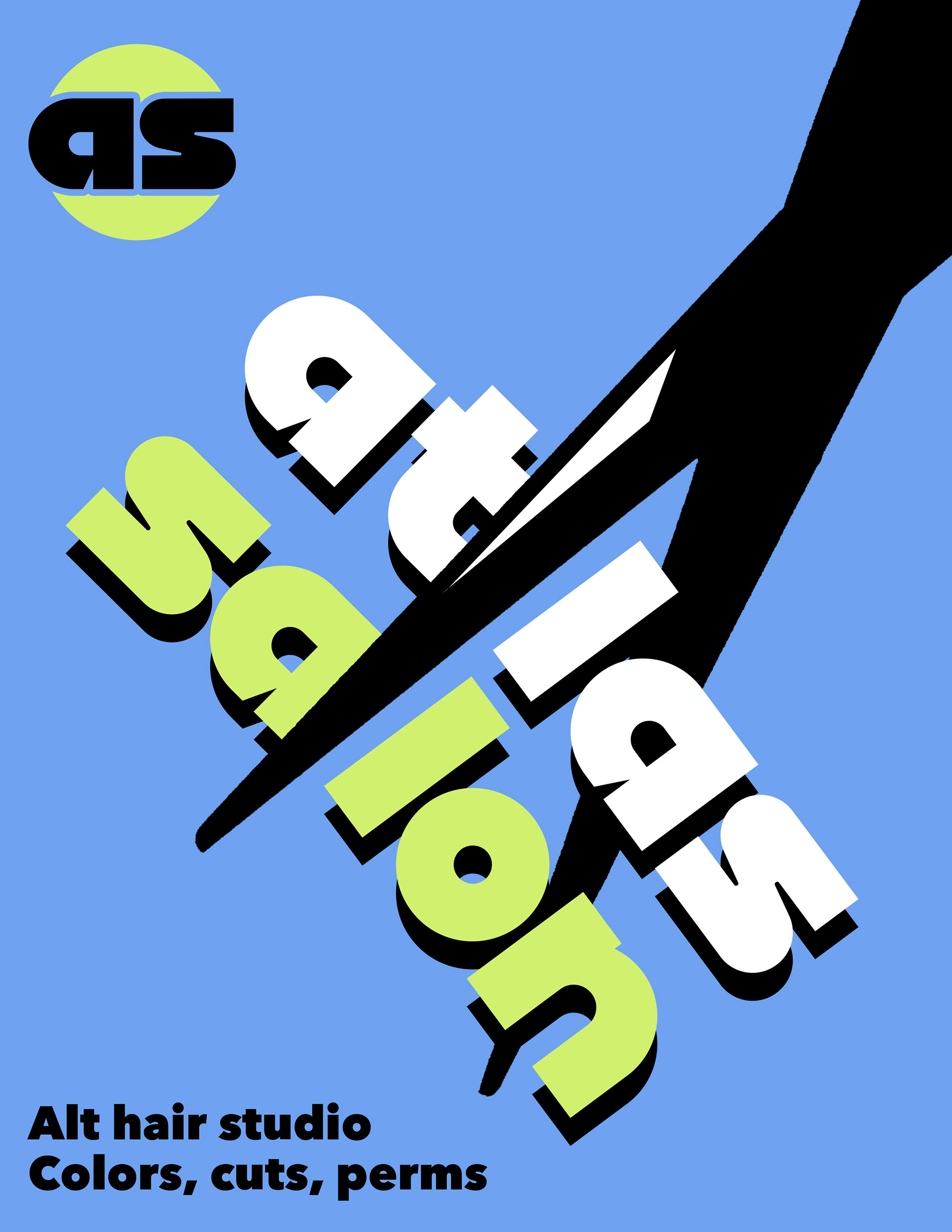
Social graphic - Illustrator and Photoshop
Logo
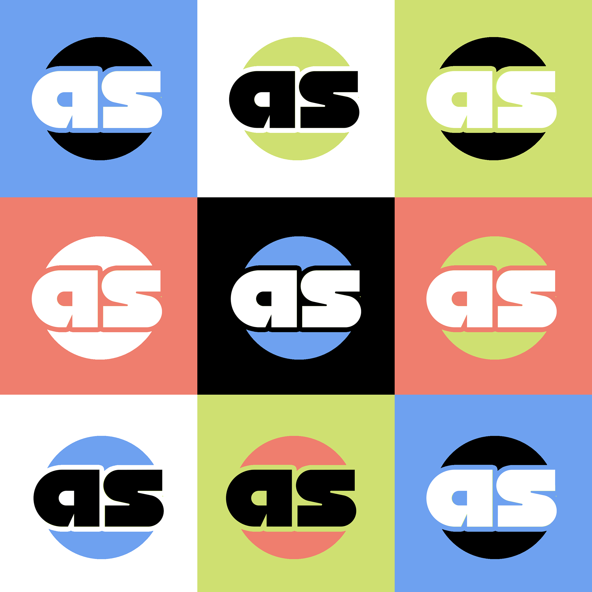
The Atlas Salon logo is bold and funky. Its circular shape represents the globe, while its modularity speaks to new hair horizons. Atlas can use the logo in combination with any of the brand colors, as shown below.
Illustration
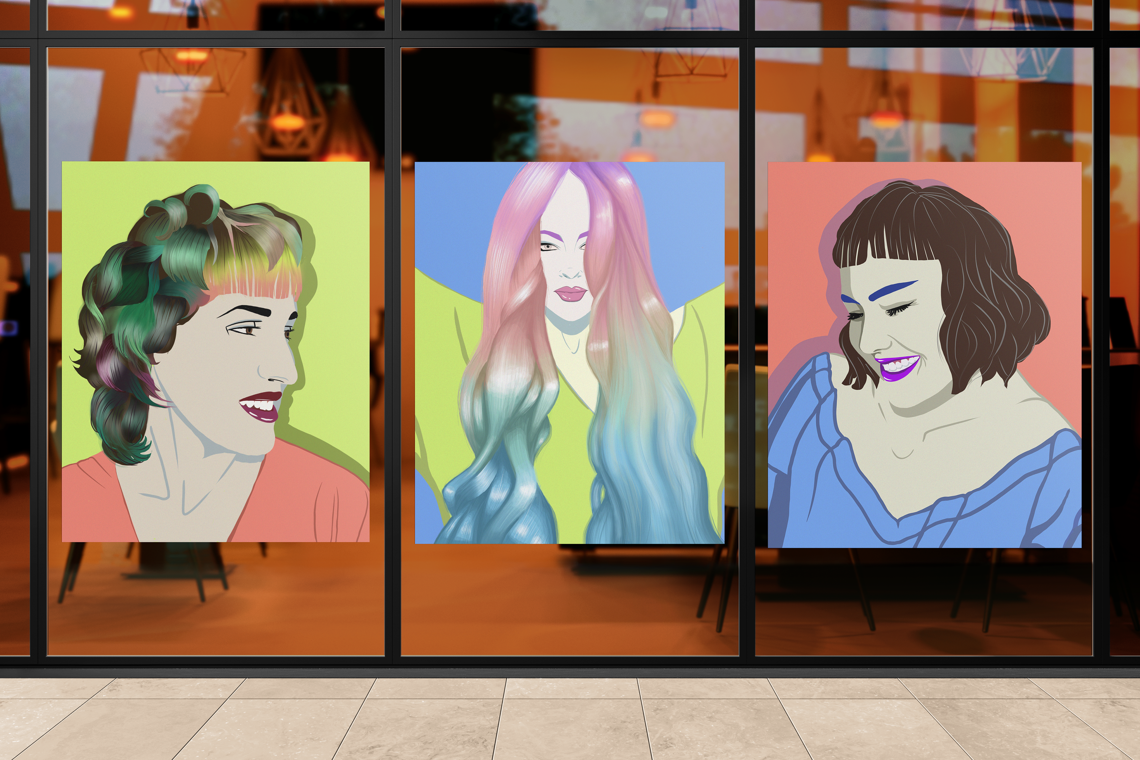
Illustrations are central to Atlas' branding. They help showcase a variety of clients, and they add a level of artistry that mirrors Atlas' services. To make the illustrations, I referenced real photos and clients from the Salon's portfolio.
VISUAL GUIDELINES
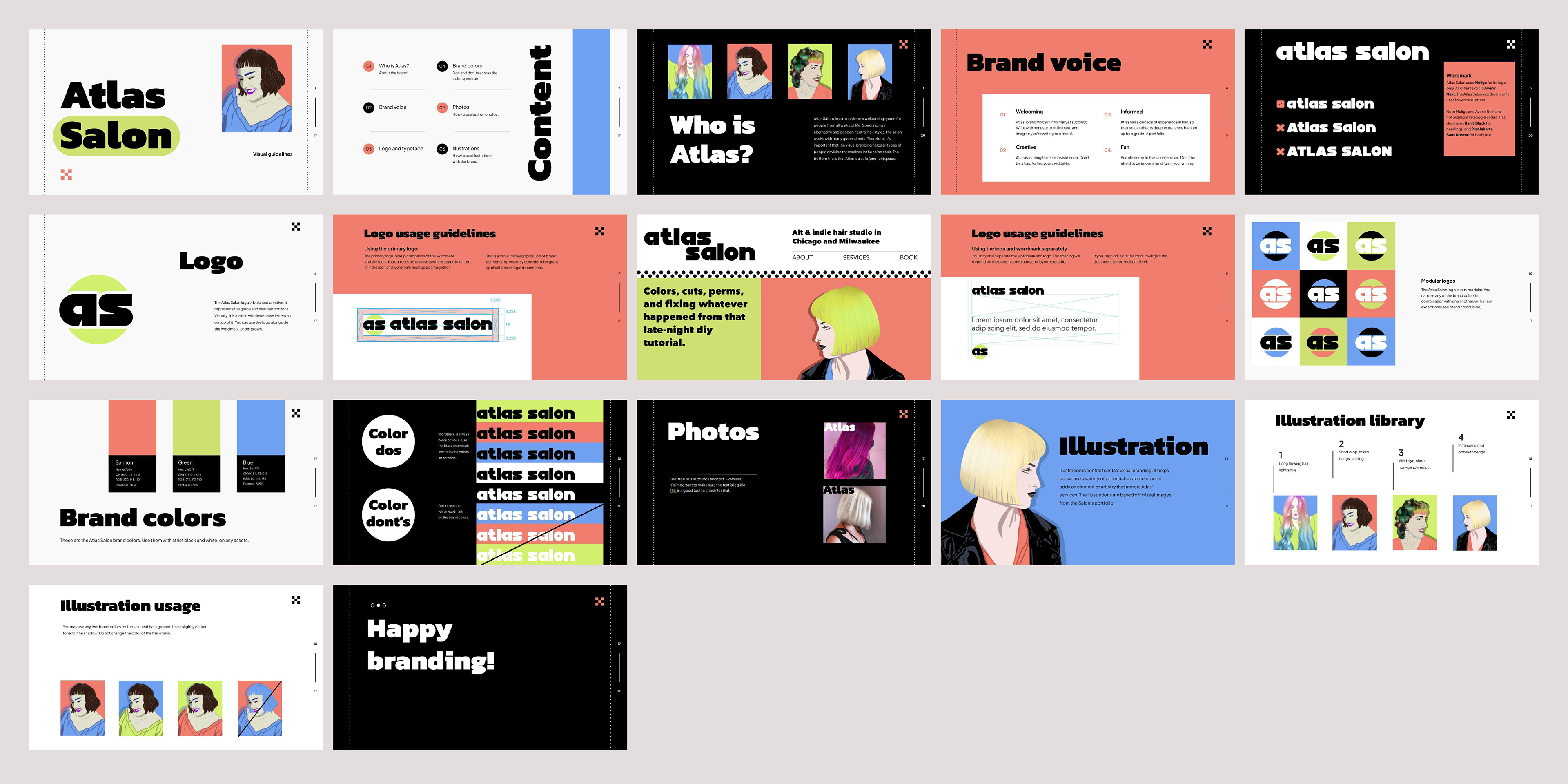
To ensure Atlas can effectively apply its brand across assets, I provided the salon with comprehensive visual guidelines. These guidelines outline how to use typography, logos, color, photos, and illustrations. As Atlas scales, this will be an essential resource for new employees learning about how to use the brand.
Behind-the-scenes
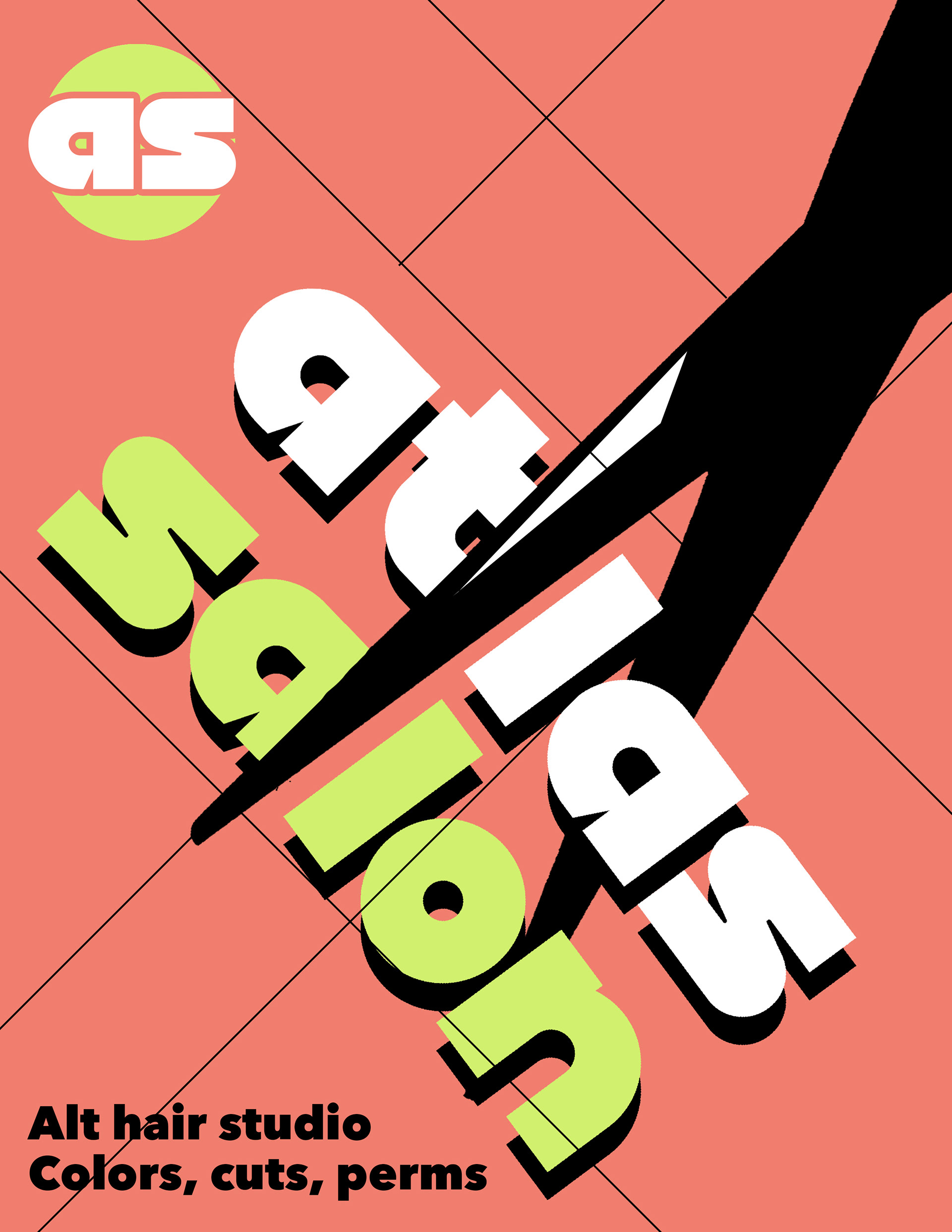
Social graphic diagonal grid
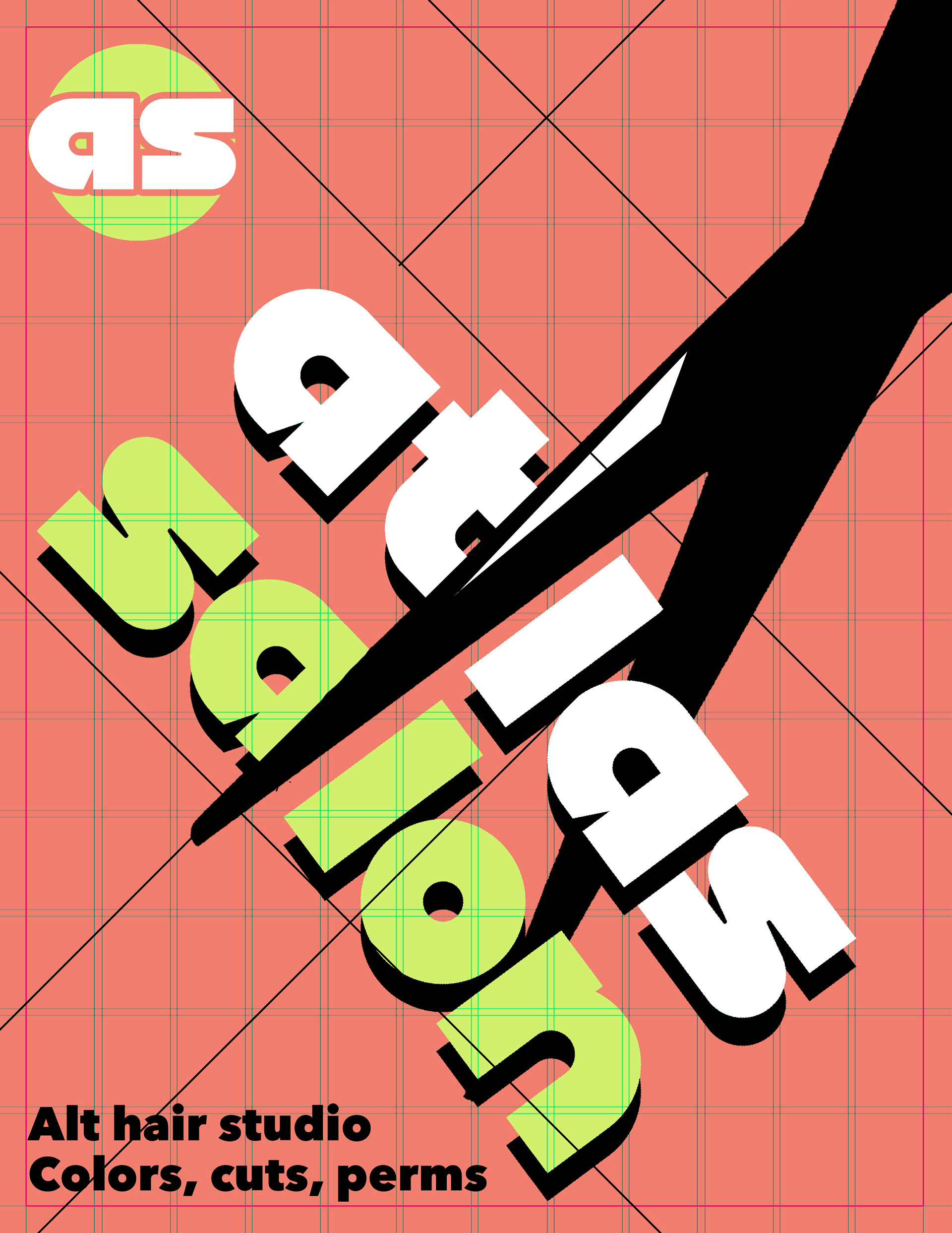
Social graphic grid
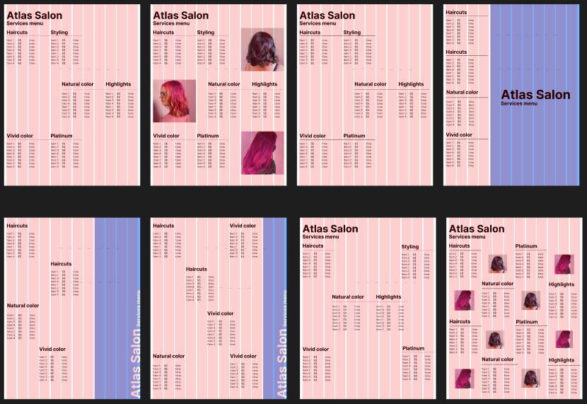
Menu layout exploration
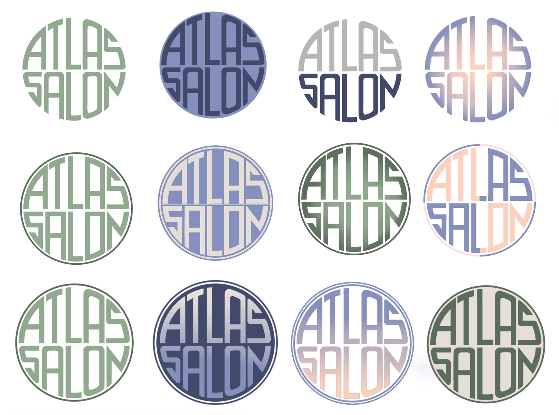
Early visual direction exploration
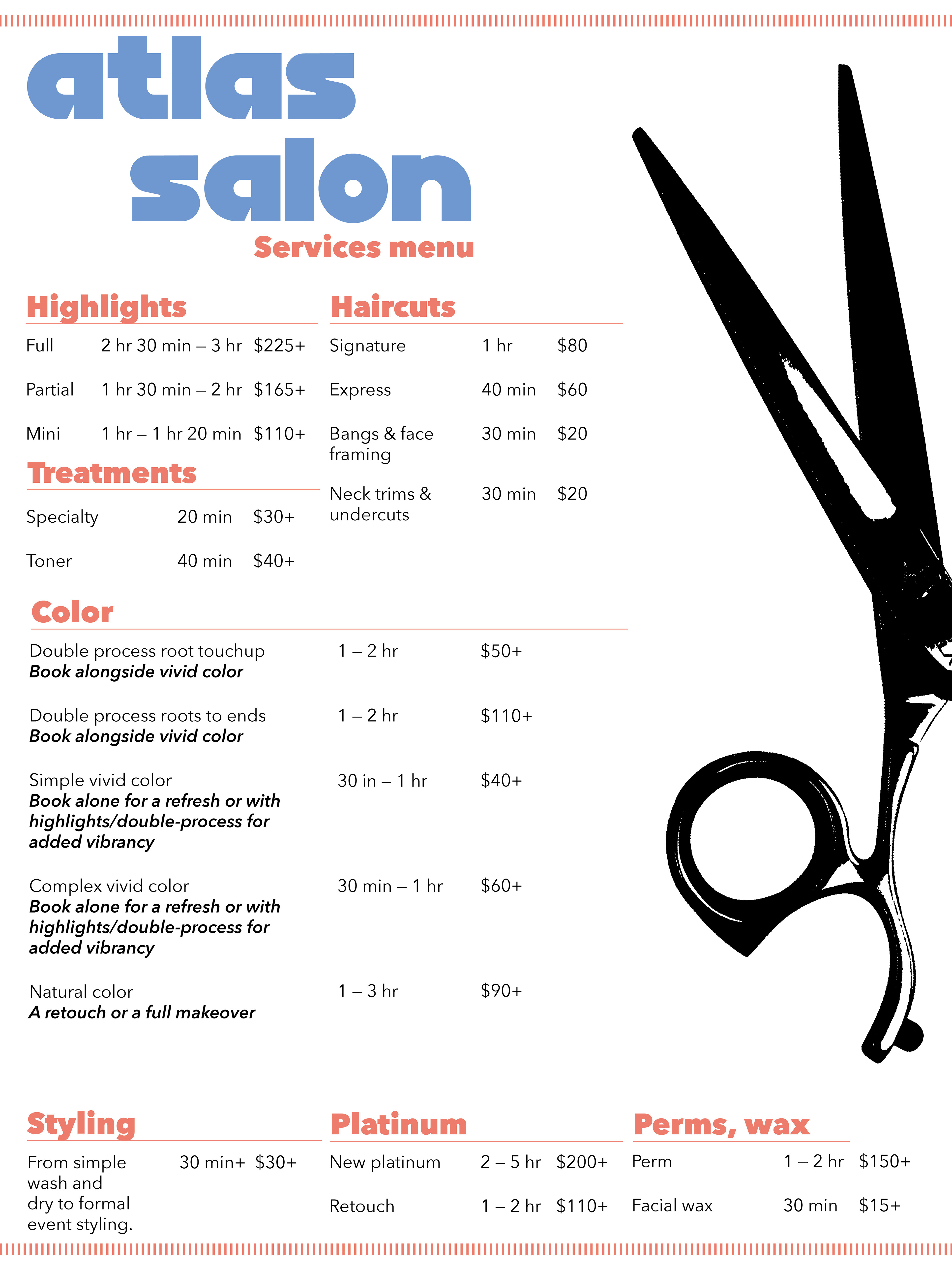
Menu draft 1
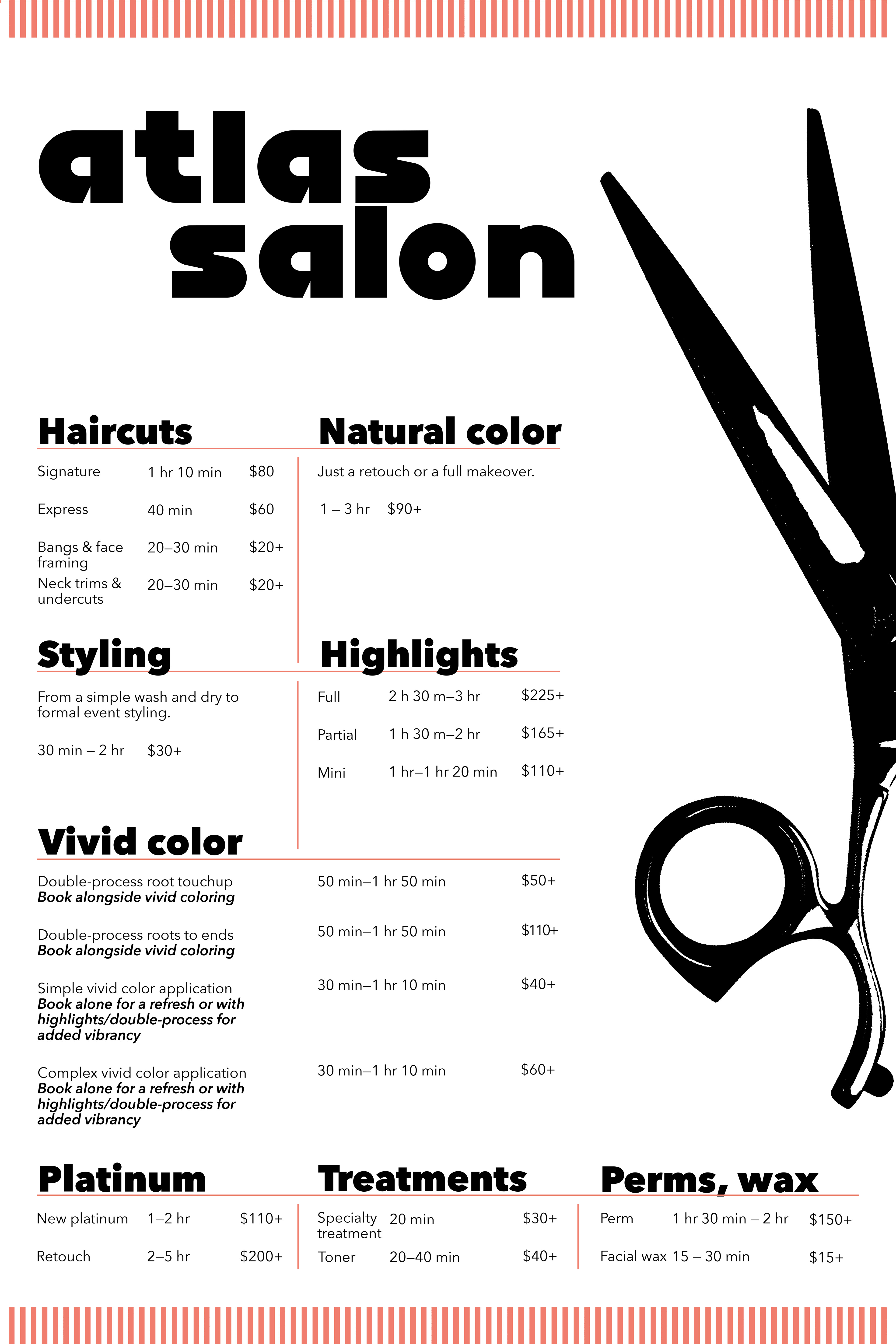
Menu draft 2
Email: keleadholm@gmail.com