MAKING vintage RECORD design FEEL MODERN
Skills/applications: visual identity, logo design, poster, record sleeve, merch design, deck design
Tools: Adobe InDesign, Illustrator, Figma
The challenge
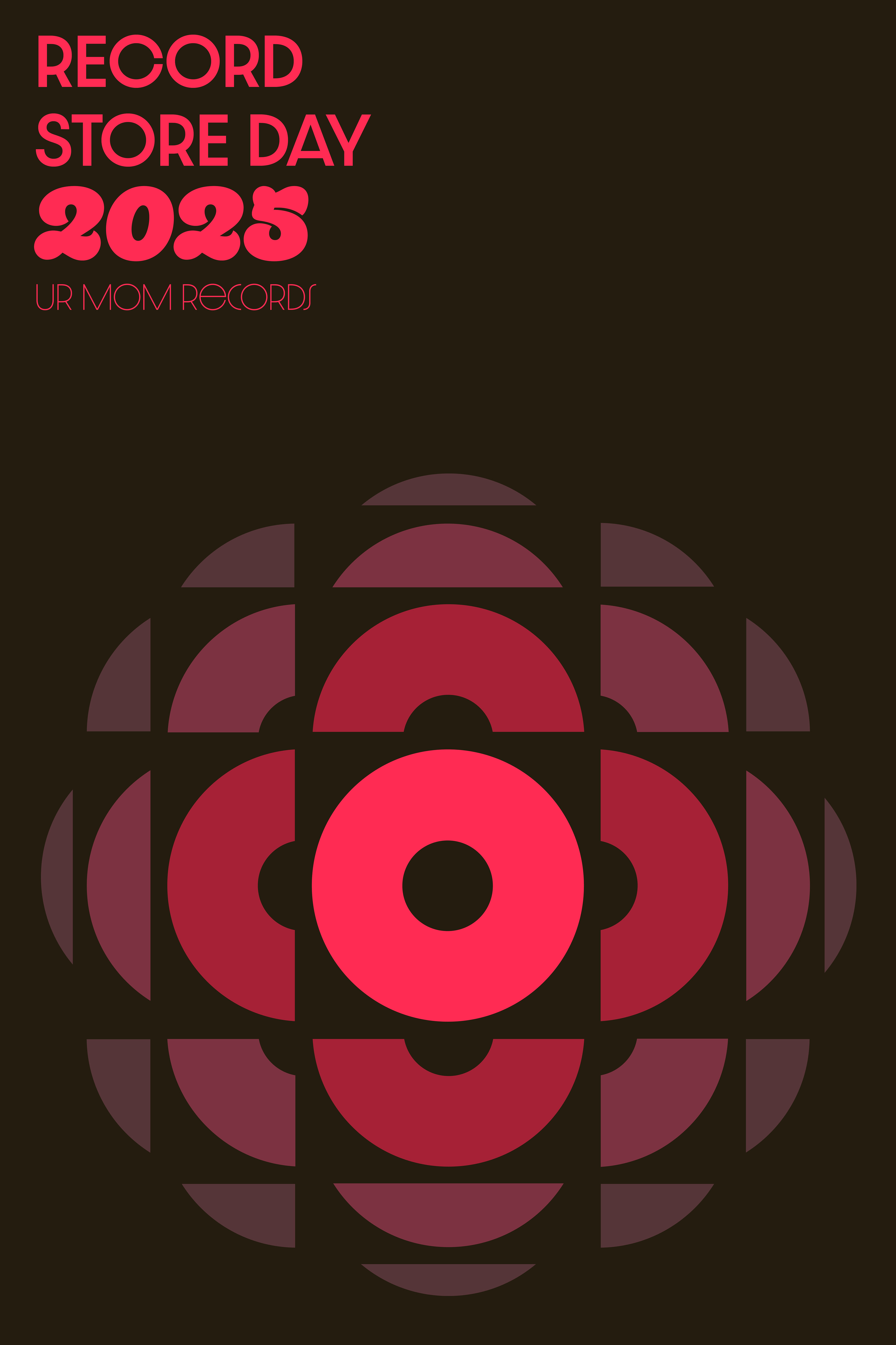
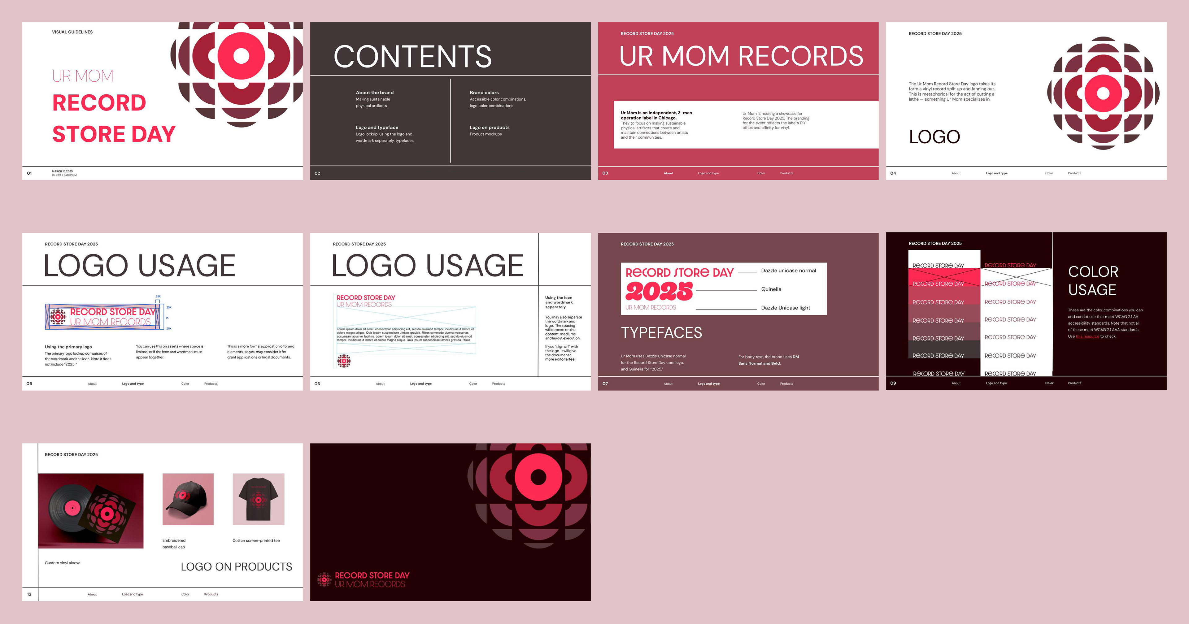
When Chicago-based record label Ur Mom Records contracted me to drive their branding for Record Store Day 2025, I knew vinyl records should be the foundation of the brand identity. Vinyl as an art form is central to Ur Mom's work. The label only releases vinyl and their owner hand-presses lathe cuts. As such, I wanted the Record Store Day branding to pay homage to the form of a vinyl without being too referential.
The result
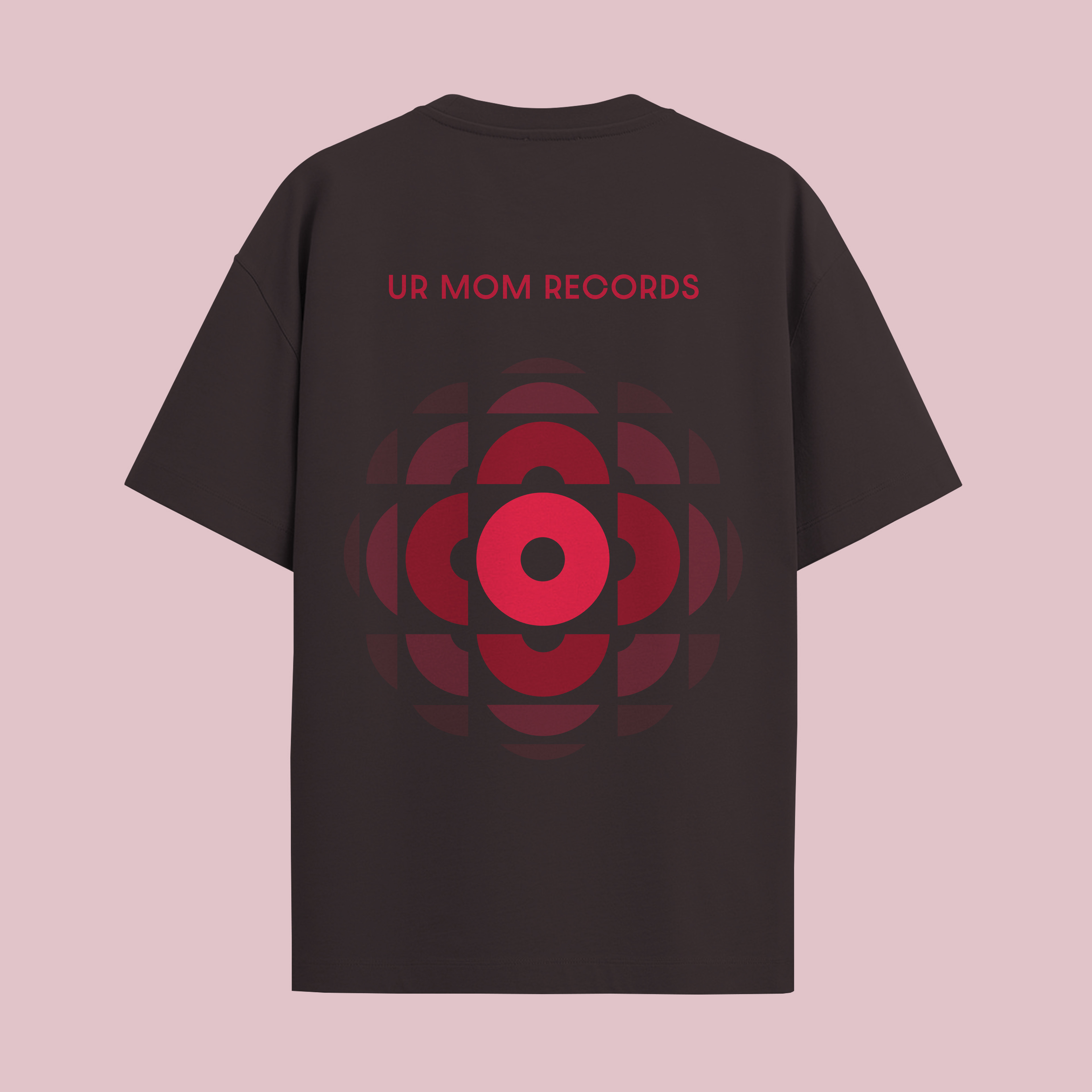
After iterating on core designs, I came up with the logo of vinyl-esque ellipses fanning out and dissolving into the background. The shape of the logo mirrors the proportions of a vinyl record. We chose a monochrome colorway to reflect the look of labels on early records. Ur Mom's vintage record collection also inspired the type and layouts, which evokes visual trends from the '50s and '60s.
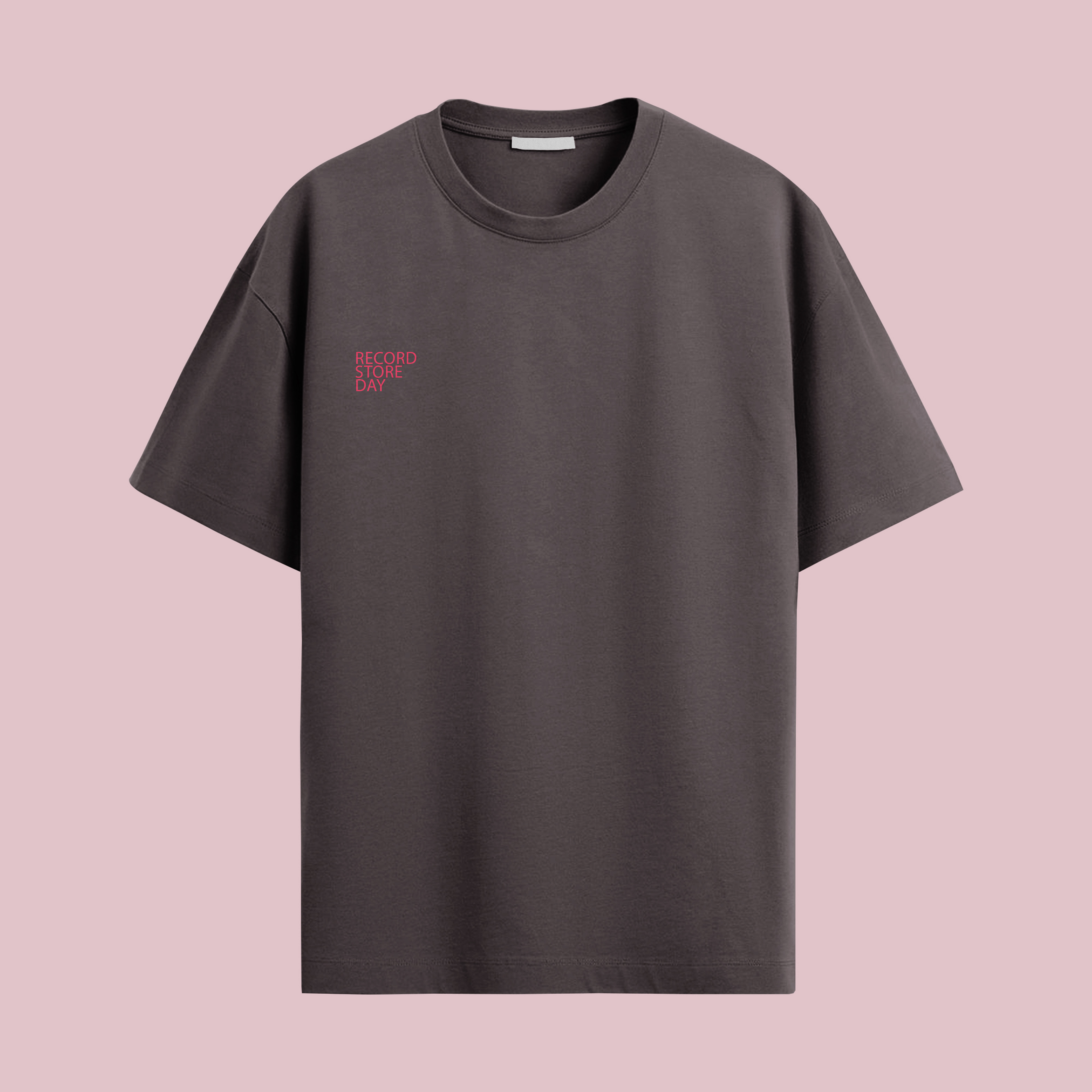
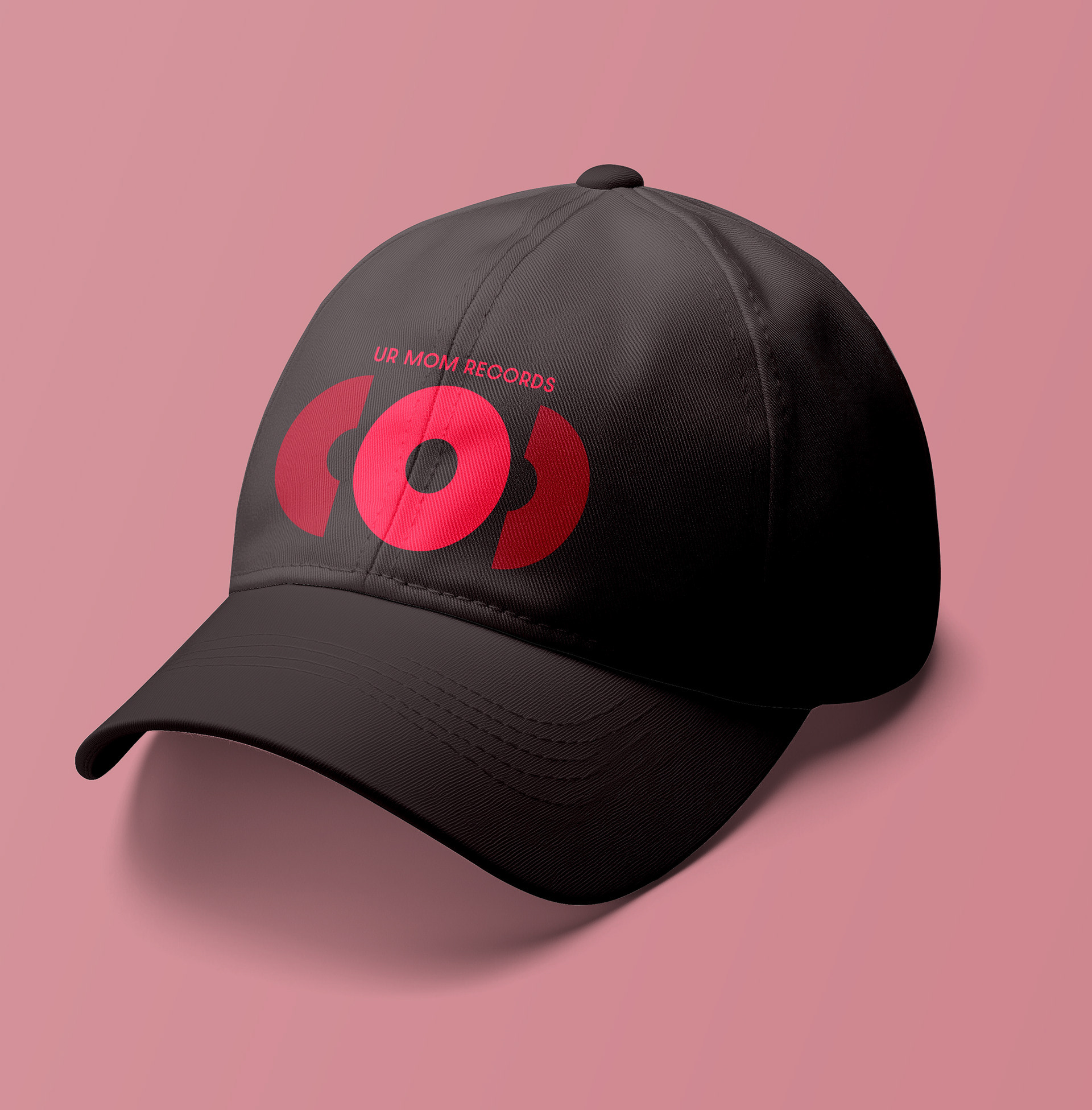
This project involved end-to-end branding, from ideation to print and merch production.
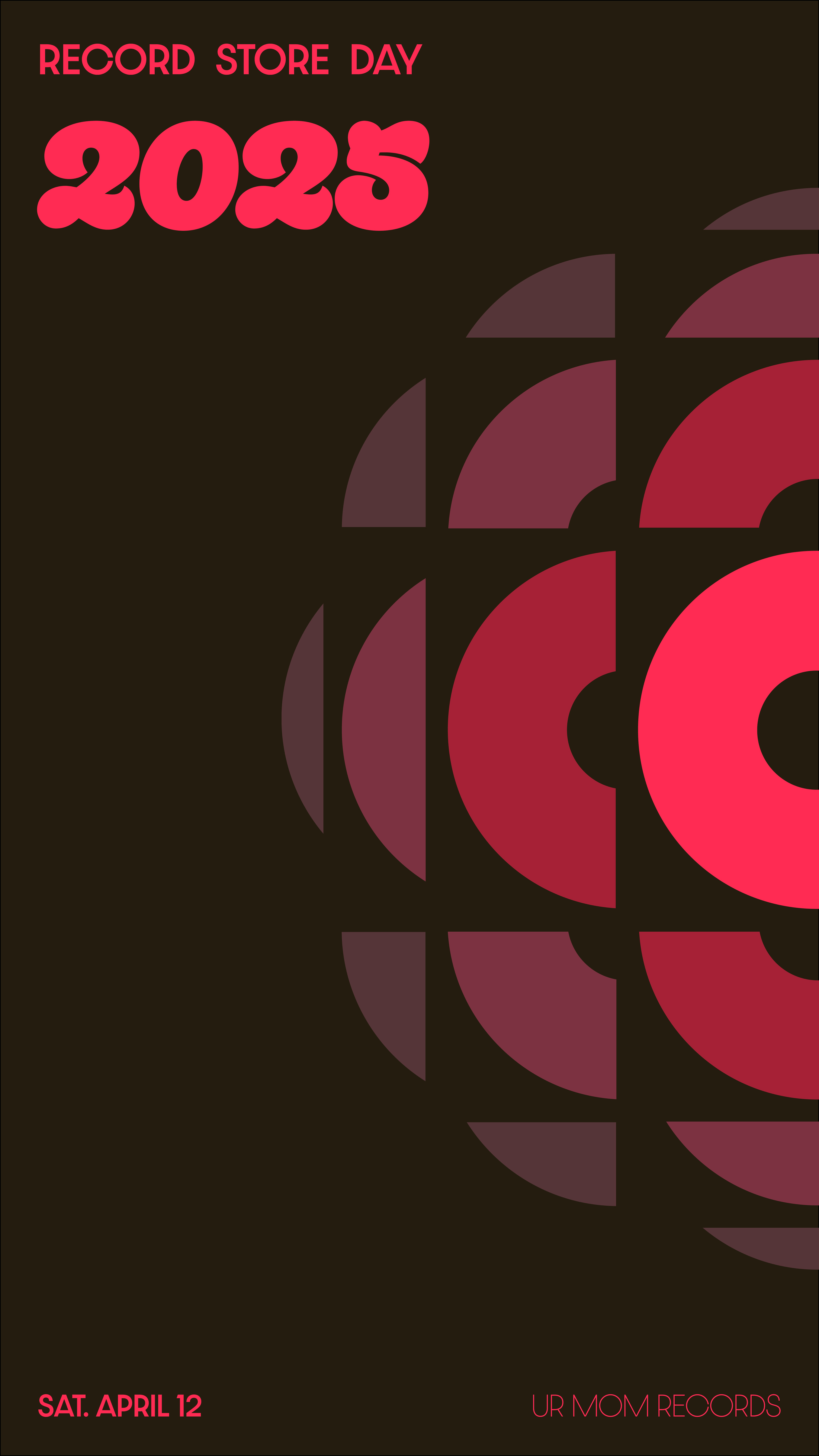
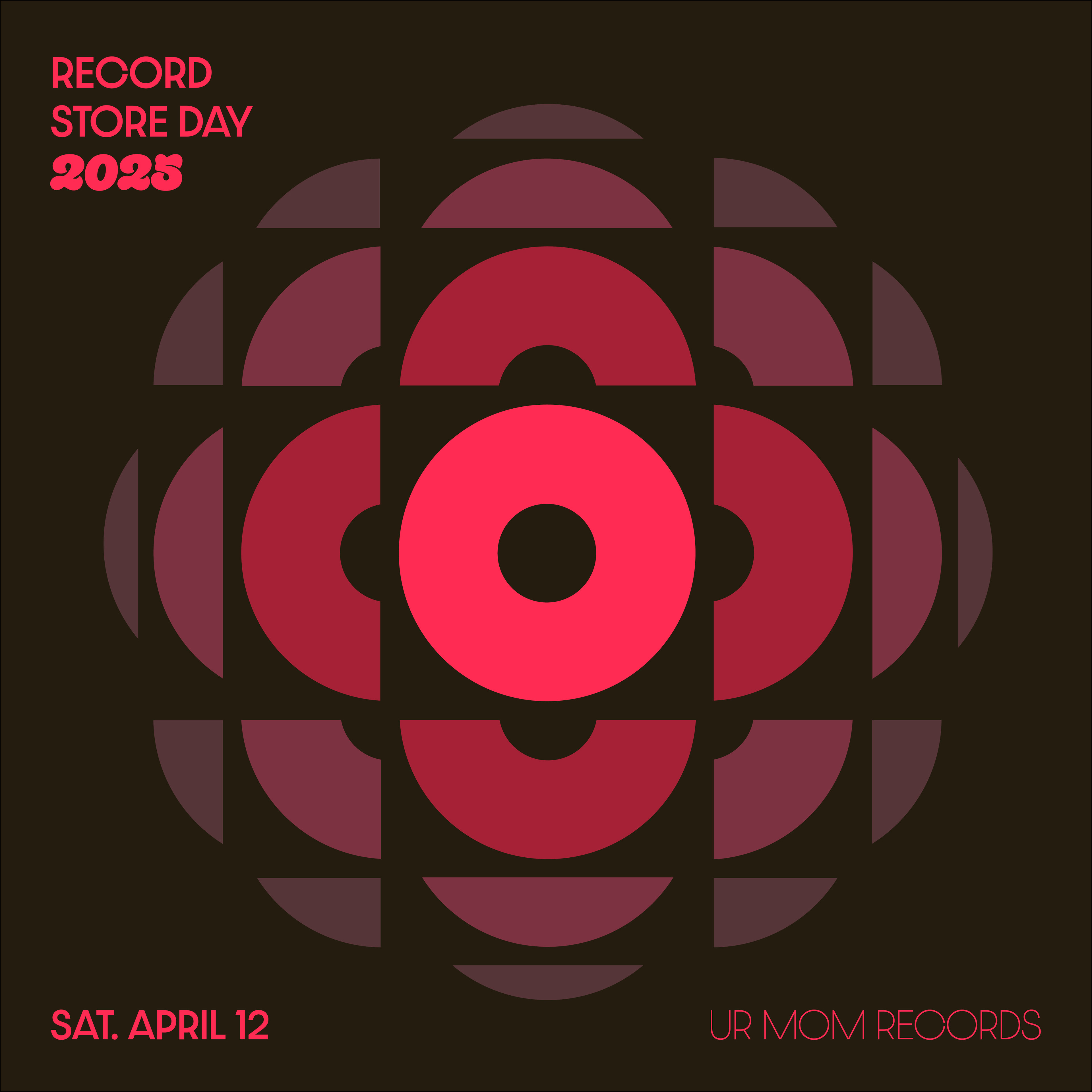
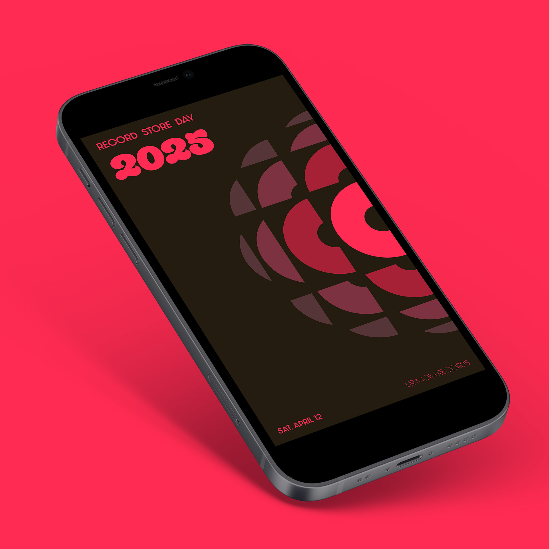
Instagram graphic mockup
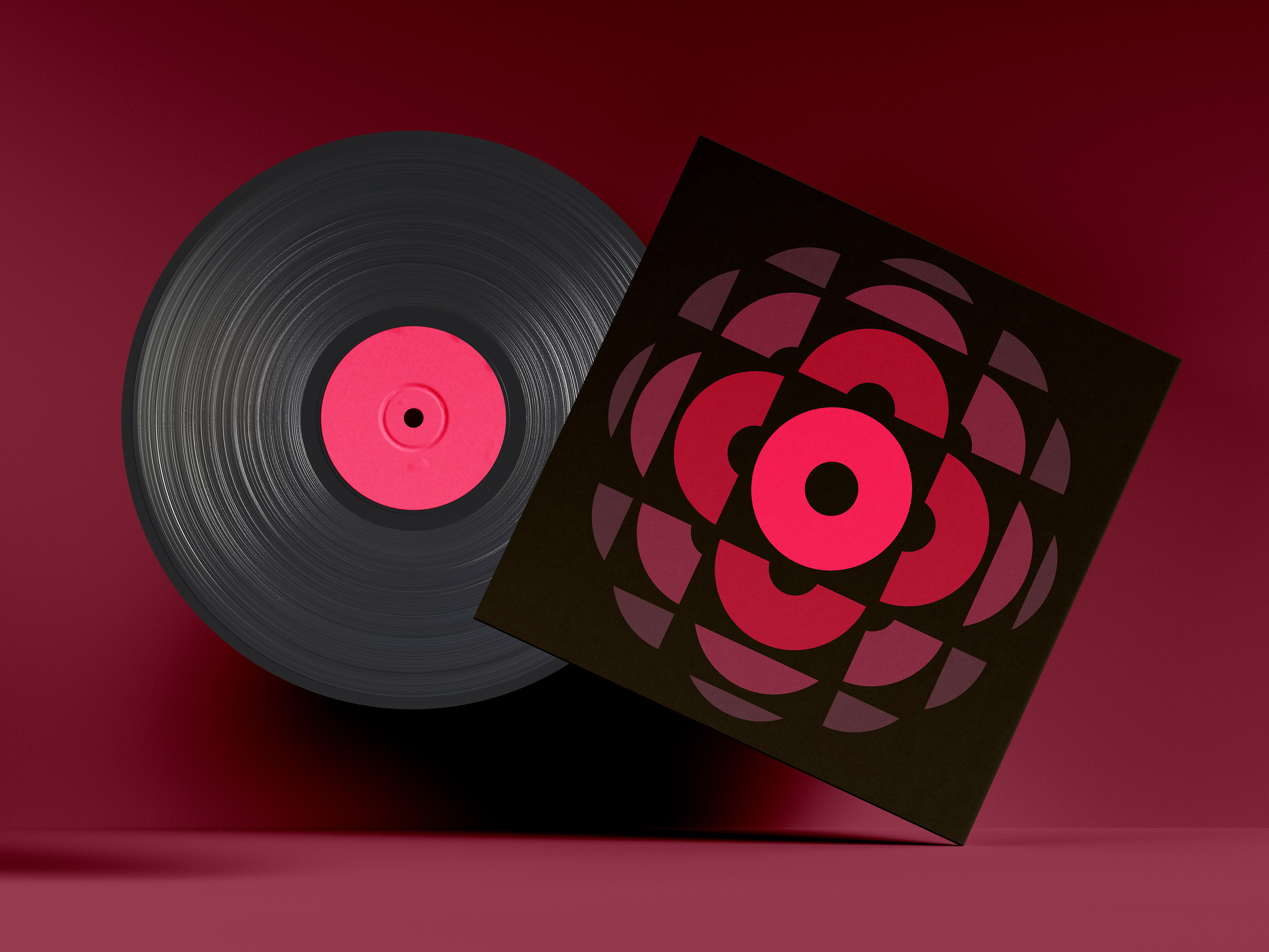
Vinyl sleeve mockup
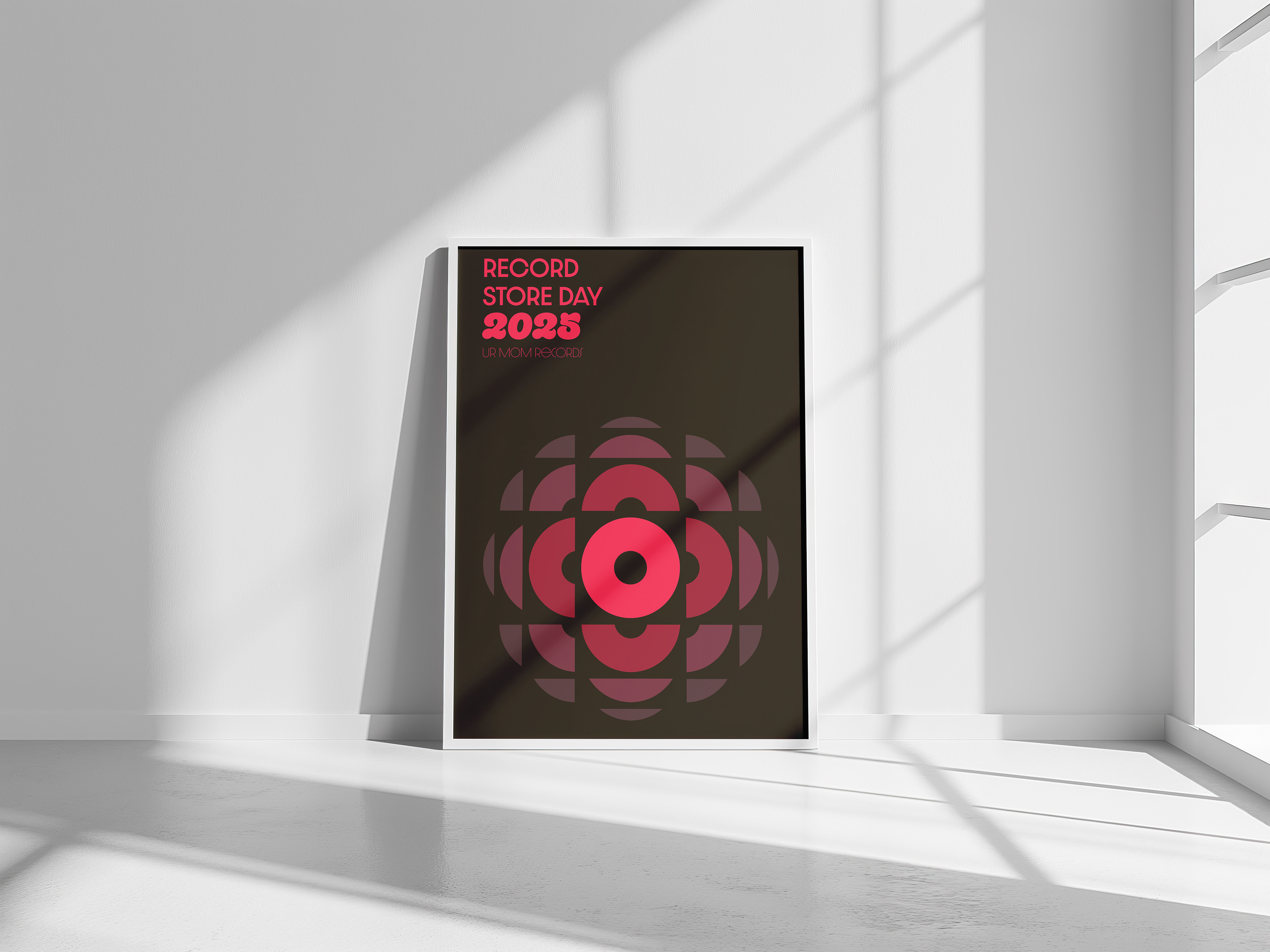
Poster mockup
RESEARCH
I began by sitting down with my client to understand their inspiration and preferences. She wanted something simultaneously retro and modern with nods to vintage records. Together, we went bin diving at local record stores and took photos of the labels we found visually interesting. I synthesized that information into a mood board, which I iterated on with my client.
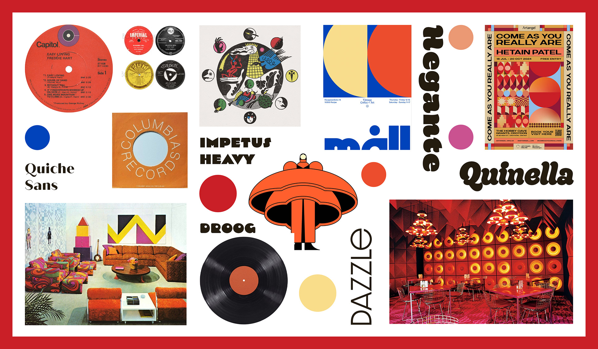
Mood board
Logo
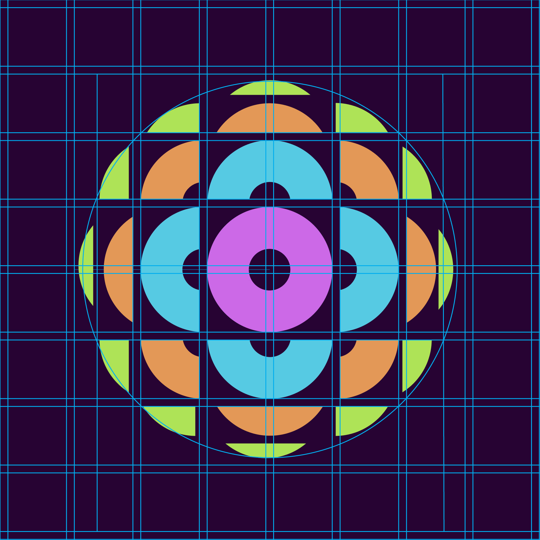
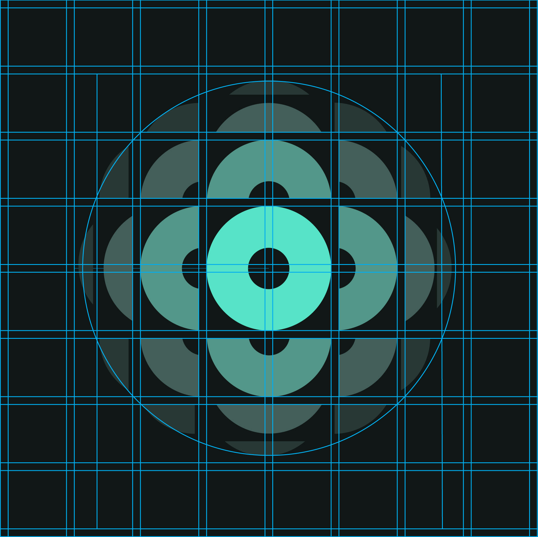
The UR Mom record store day logo takes its form from a vinyl record, split up and fanning out. This is metaphorical for the act of cutting a lathe — something the label specializes in. The circles and sections of circles create a visual rhythm that pulses like a rotating record. In exploring what shape the logo would take, I cut up circles in various ways using different grids.

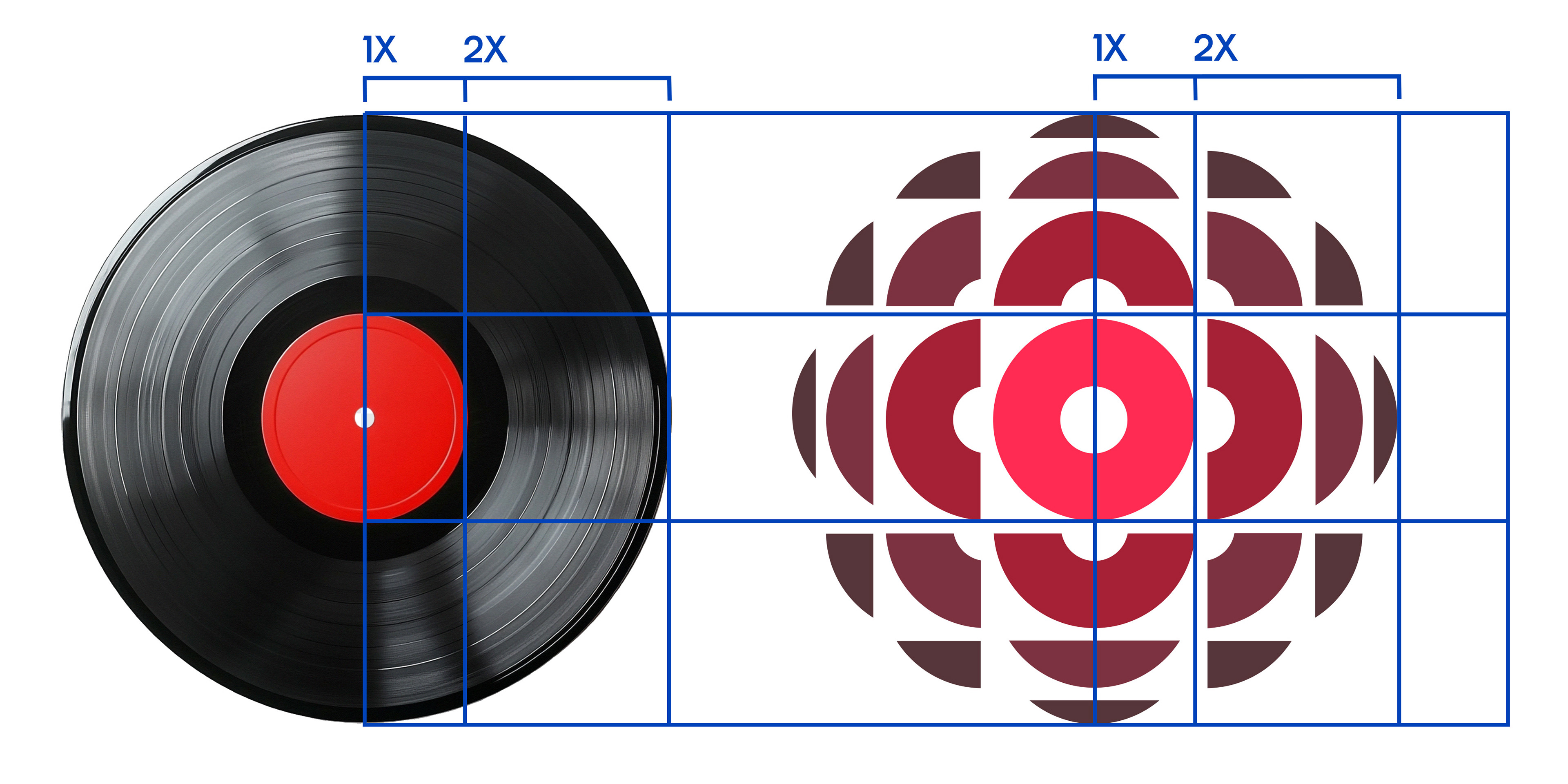
Proportion comparison
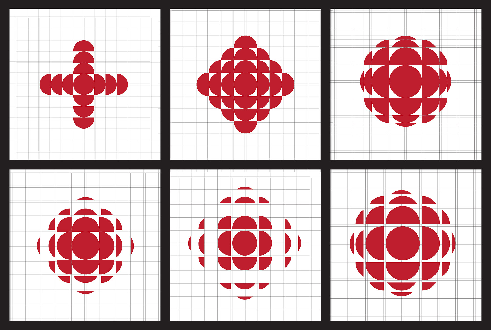
Shape iterations
Color
During our record diving escapades, we noticed many vintage records use simple colorways: one color plus black or white. We took this motif a step further with a monochrome colorway that references vintage record sleeves with a modern twist.
While developing our final colorway, I experimented with different color combinations and applied them to the logo.


Square palette
Monochrome palette
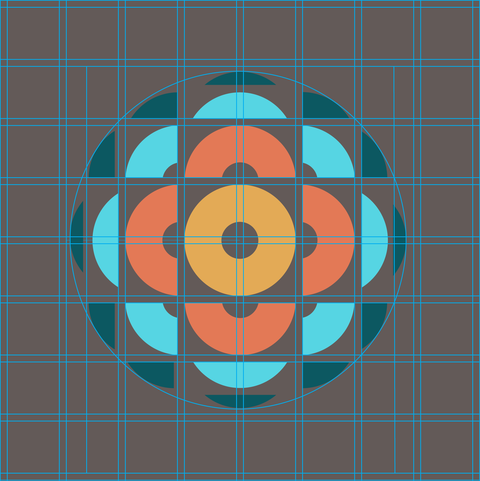
Split complementary
Typography
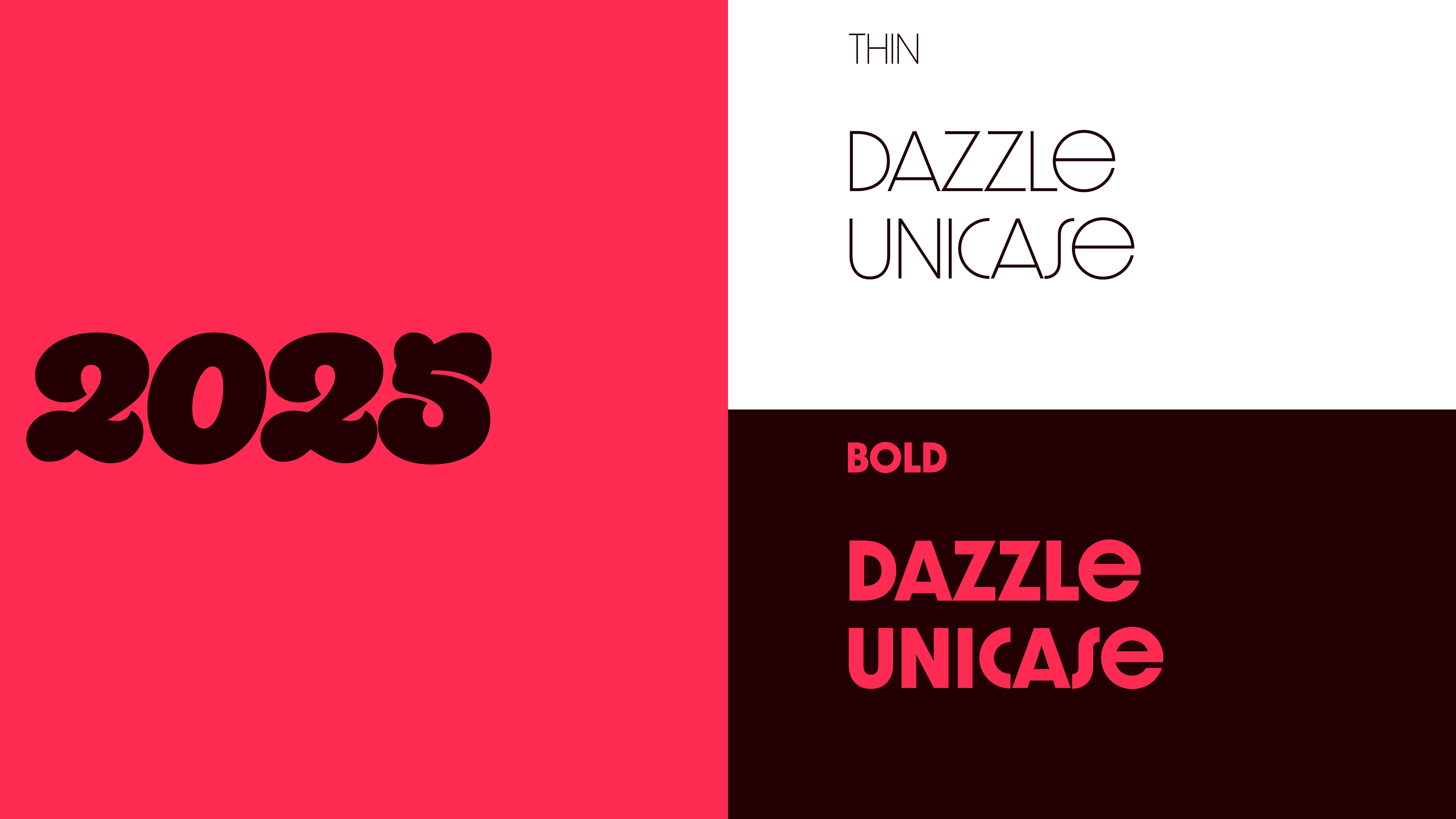
All of the typography in this project was for the primary logo lockup. Since the icon was fairly conventional and subdued, I knew the wordmark had to pack a punch. For the year "2025," I chose Quinella for its retro and bulbous look. I selected Dazzle Unicase because I felt its clean, extremely uniform lines contrasted well with Quinella, and because it reminded me of the type in 1950s advertisements.
Email: keleadholm@gmail.com