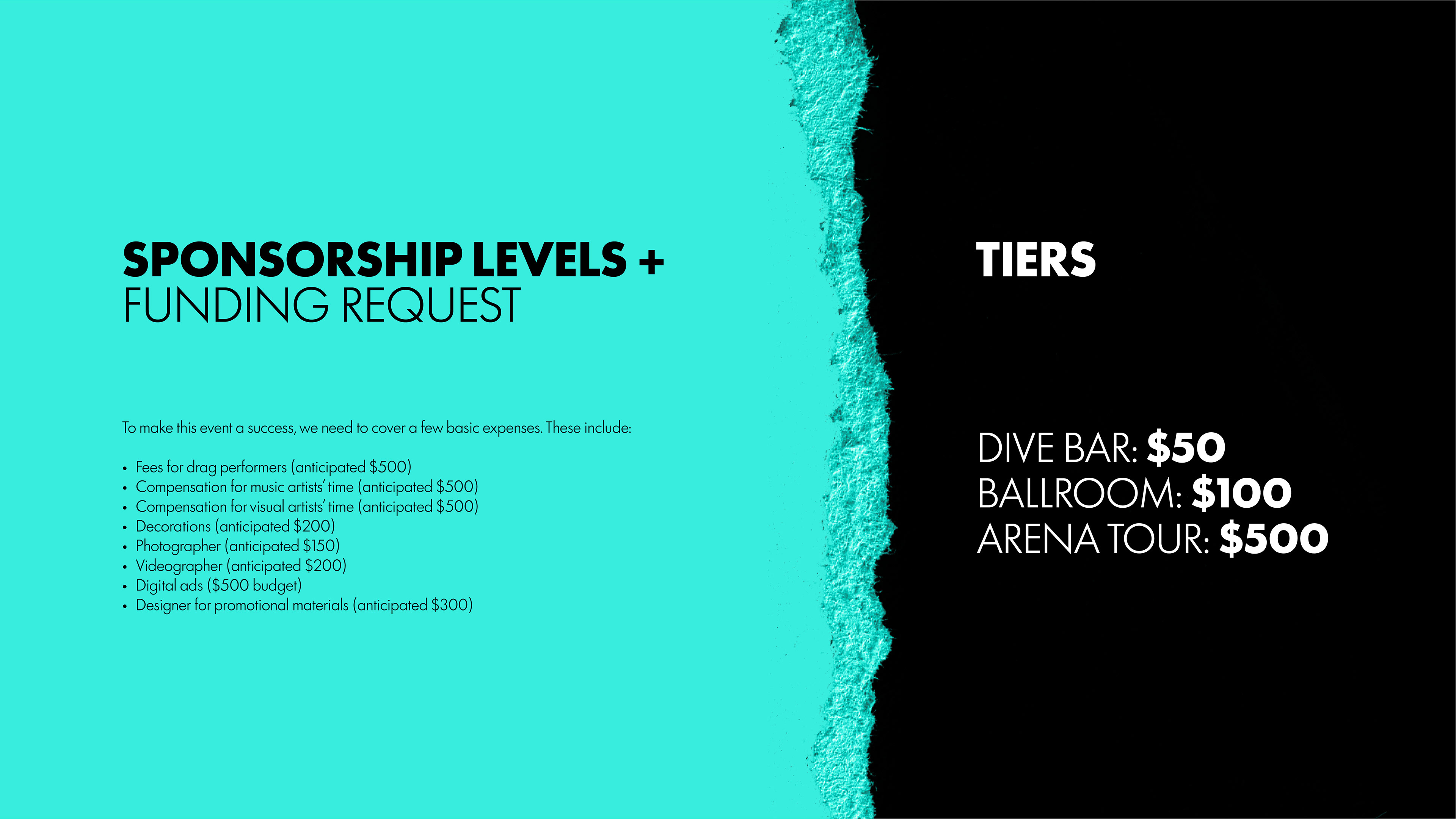
Funding a punk pride concert
Skills/applications: Deck design
Tools: Adobe Photoshop, InDesign
The challenge
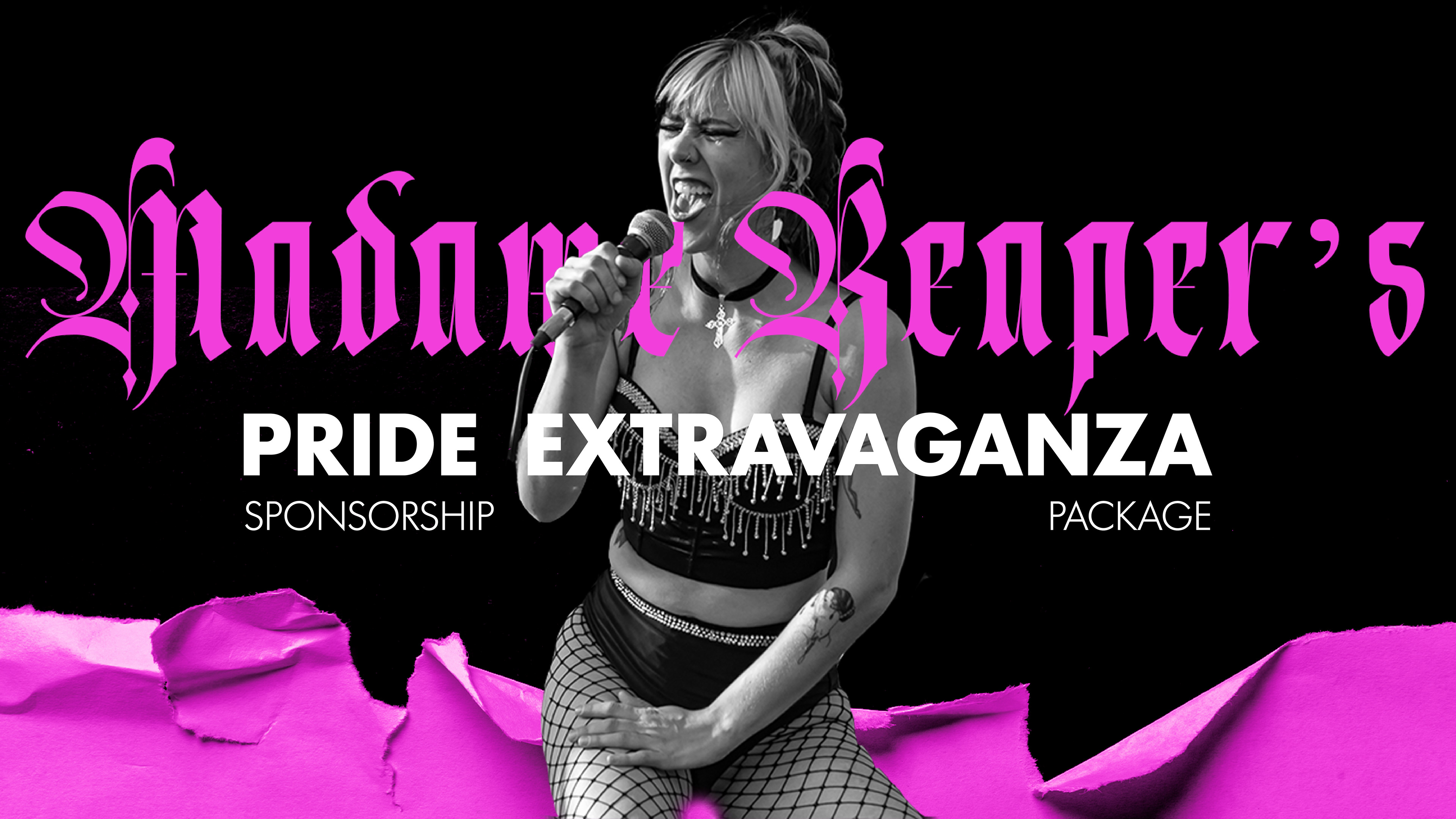
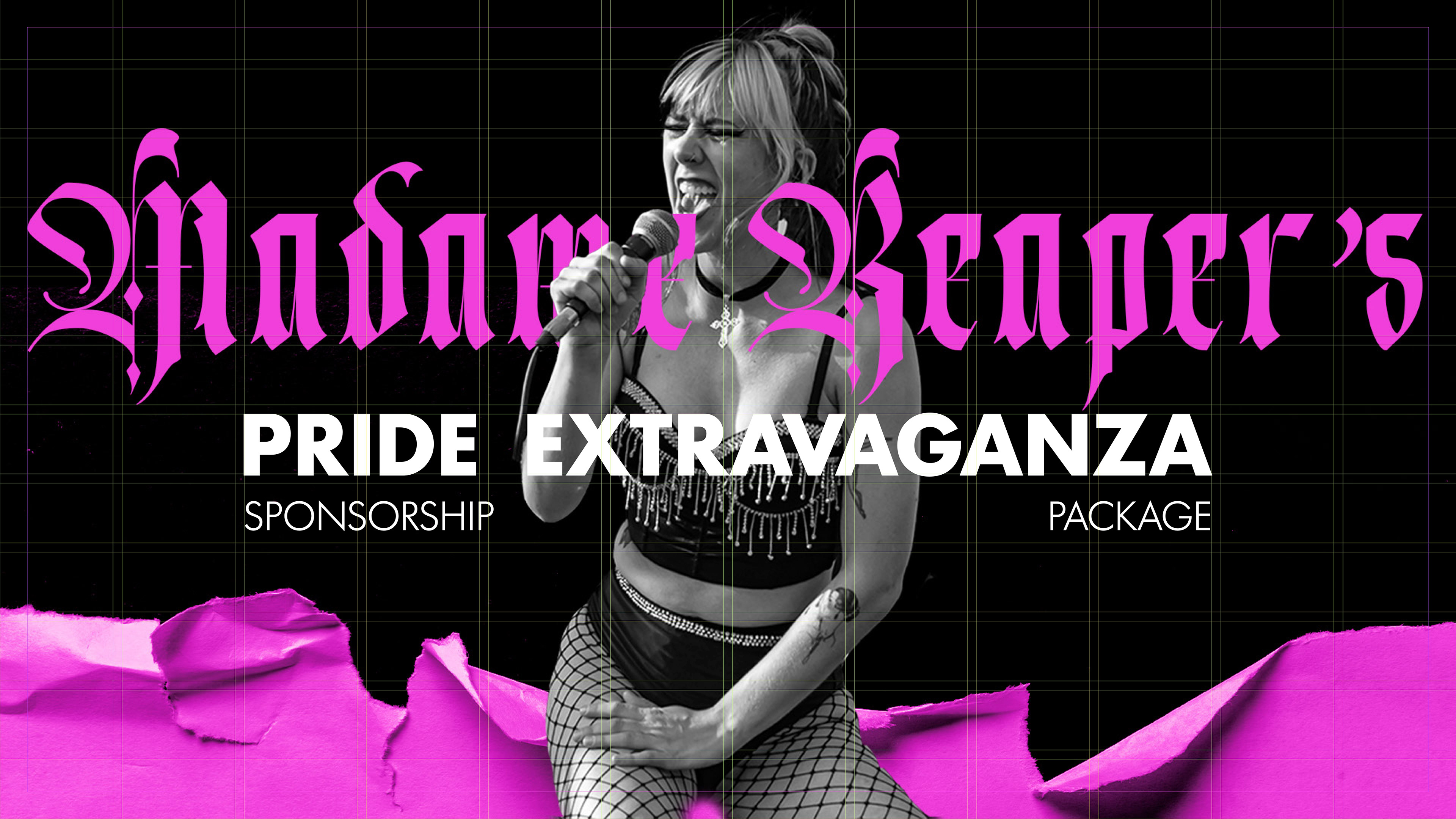
This is a sponsorship deck I designed and wrote the content for. The purpose was to convince sponsors to fund a Pride month benefit concert while visually conveying the punk ethos of the Madame Reaper music project. In an effort to appeal to corporate donors, the deck simplifies the Madame Reaper brand with clean lines and block colors.
The result
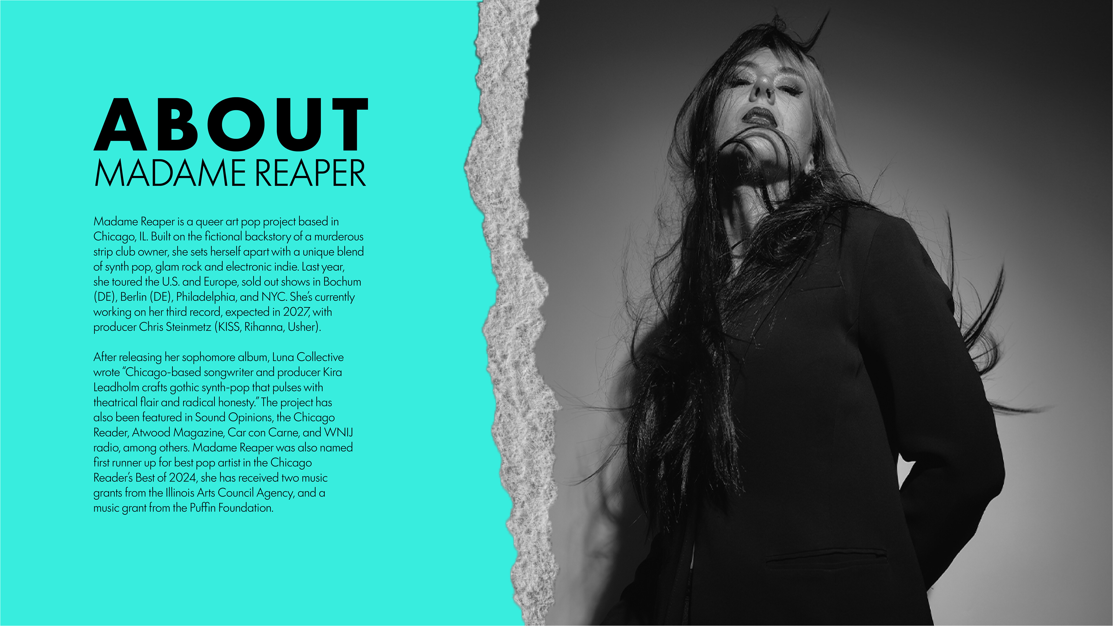
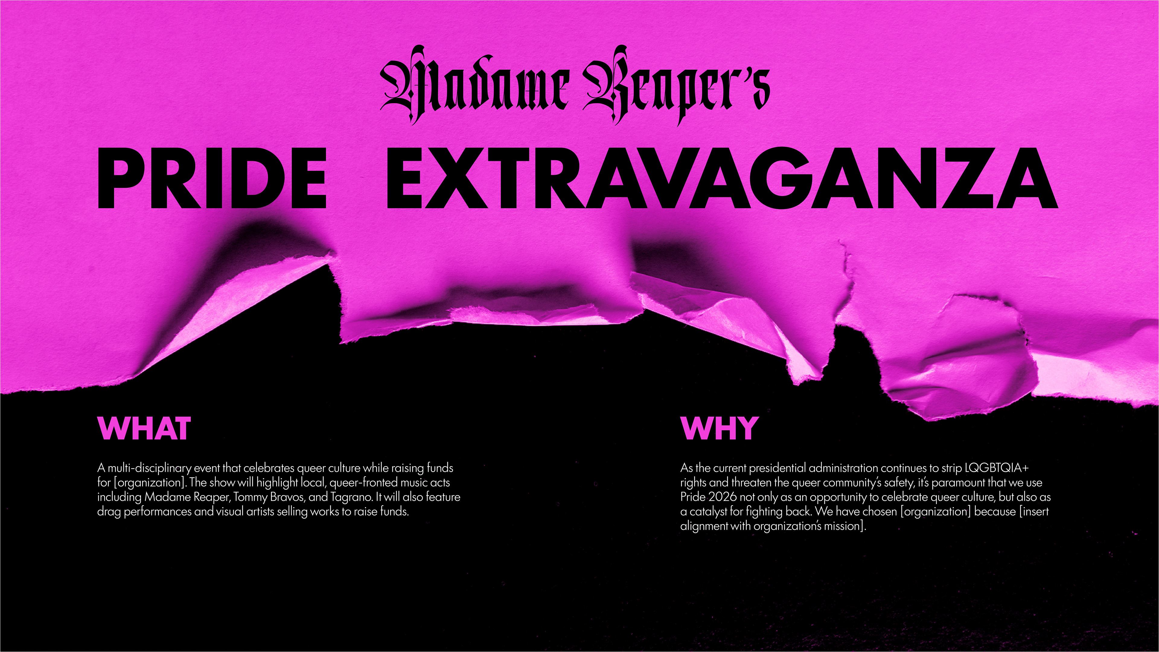
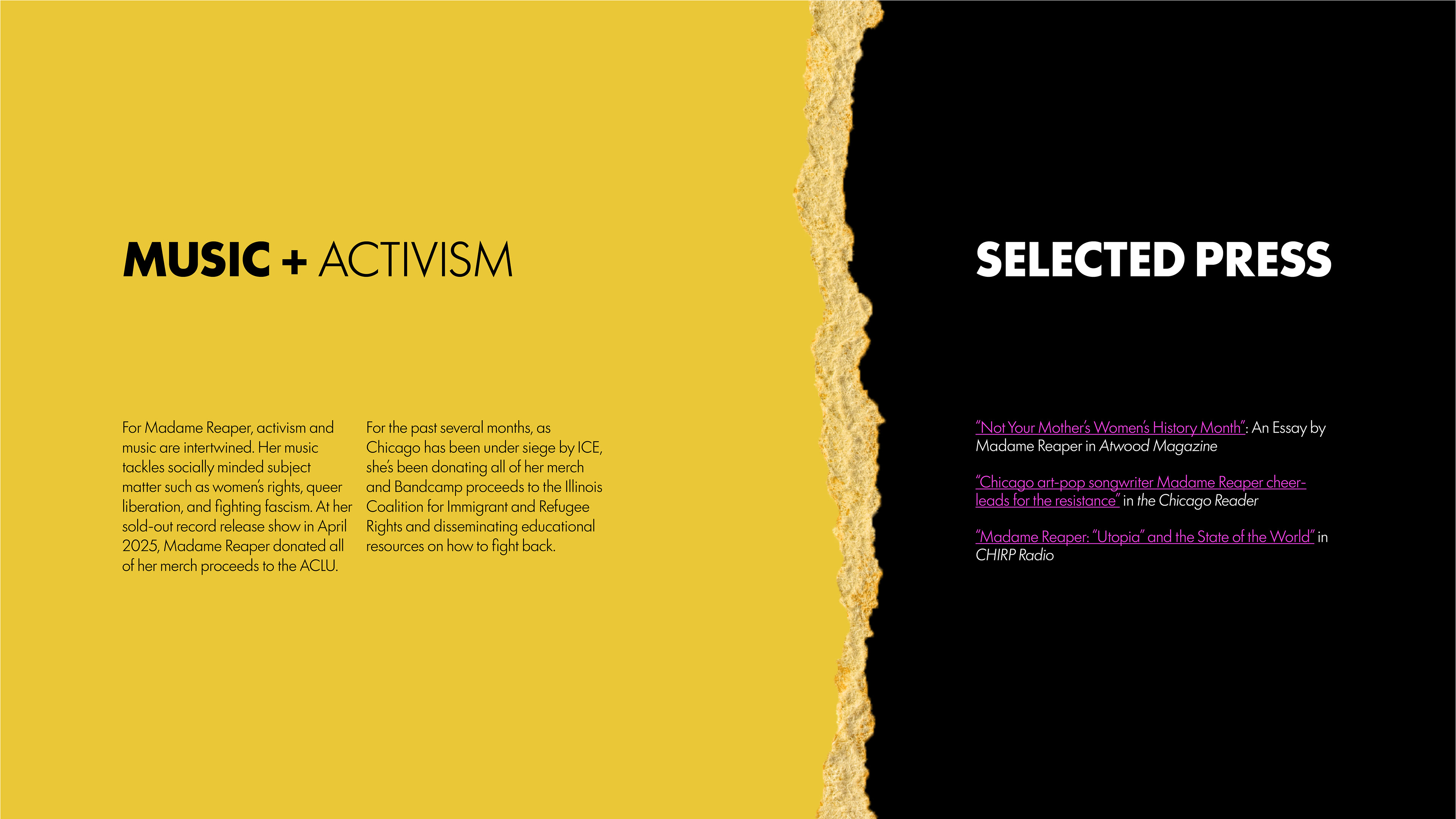
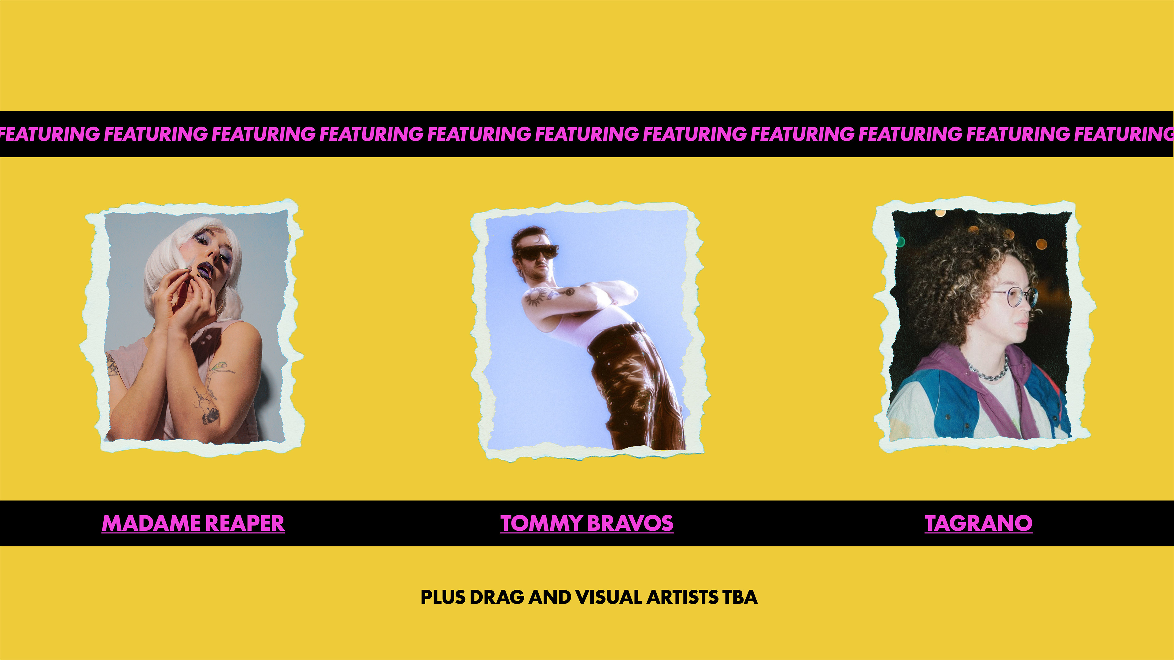
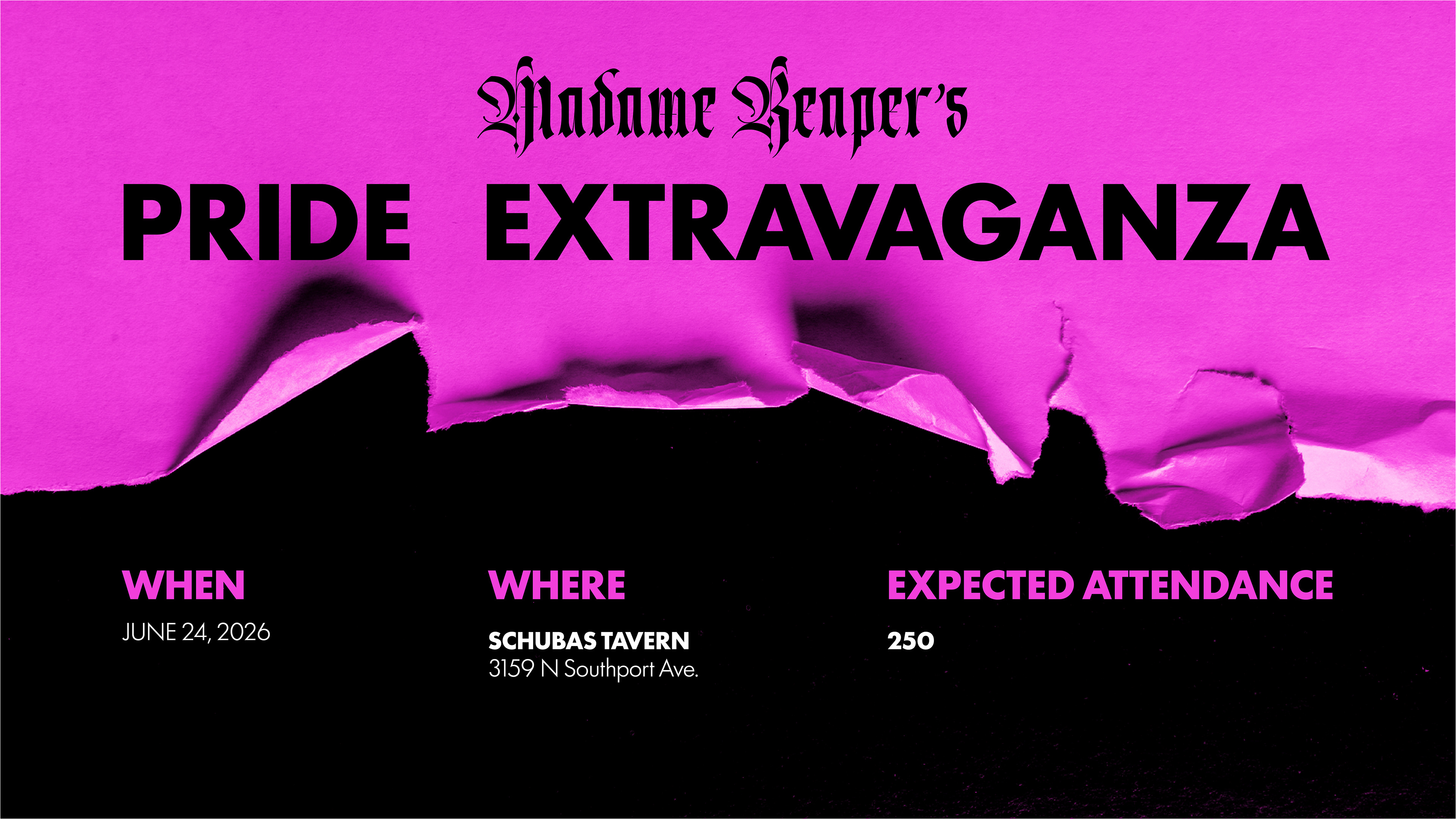
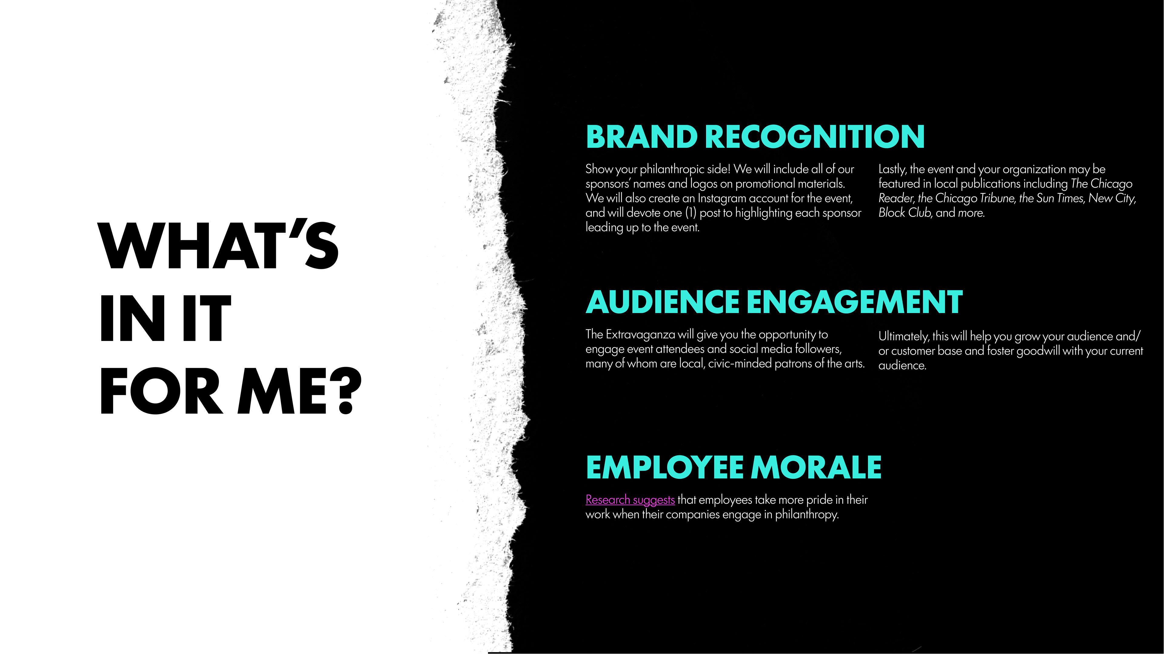
The final deck reimagines the Madame Reaper brand for a donor audience. It preserves appropriate aspects of the original brand, such as ripped paper and a gothic typeface, while exploring a new color colorway and more subdued layouts.
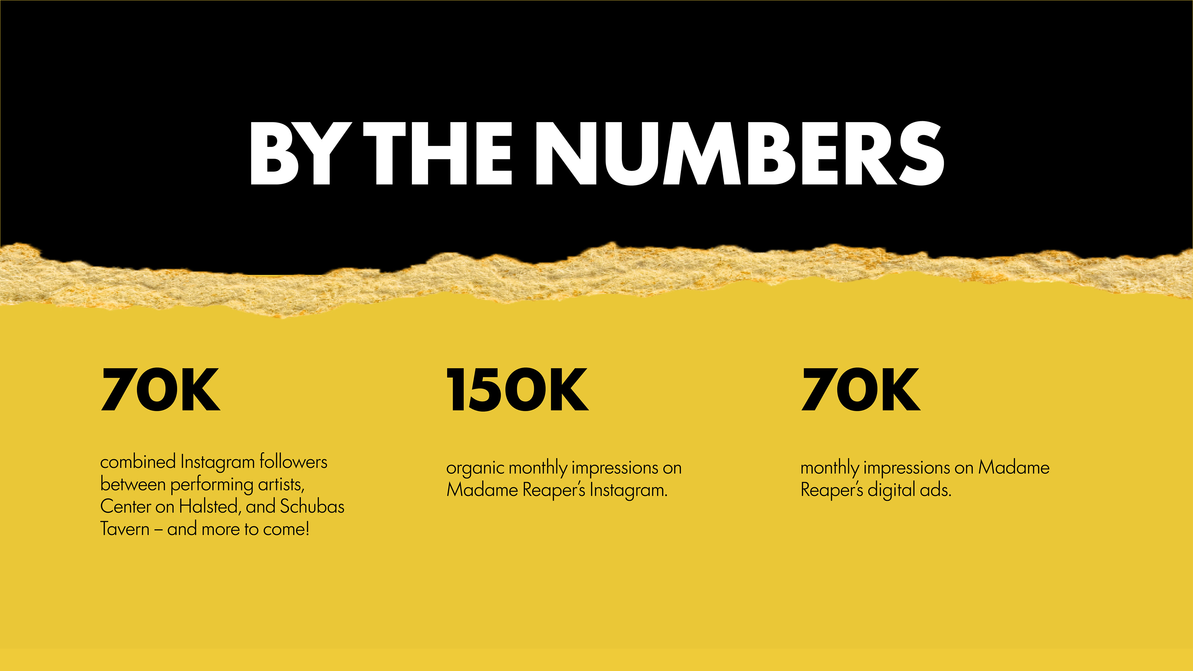
COLOR
In selecting the colors for this project, I aimed to create visual impact so strong that donors would have no choice but to engage with the deck. Using Adobe's color palette generator as a starter kit, I opted for a triad colorway that integrated the hot pink of the Madame Reaper brand.
TYPOGRAPHY
I wanted this deck to cleanly harmonize with Madame Reaper's visuals, so I borrowed Destroyers and Futura 100 from the Madame Reaper brand. I felt using Futura 100 reigned in the Madame Reaper logo — which is quite ostentatious — while balancing corporate and artistic inclinations. I leveraged different weights to create a clear visual and information hierarchy.
Design and layout
My designs heavily feature ripped paper — a facet of the Madame Reaper brand. The ripped paper contributes to an edgy, punk-inspired look without introducing chaos. For the deck's layout, I relied on a simple 12 x12 grid to maintain consistency and rhythm across the slides.
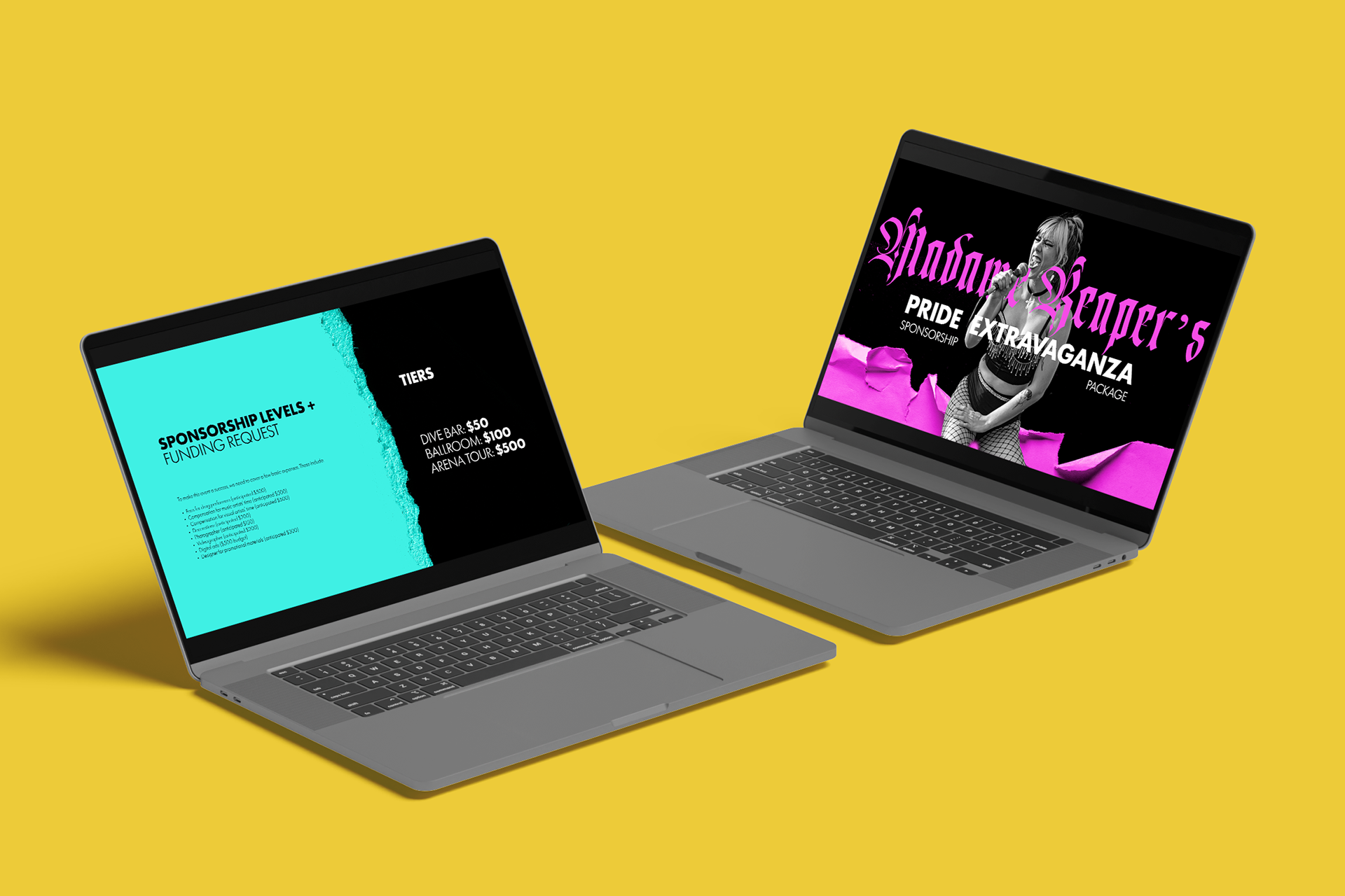
Grids

Email: keleadholm@gmail.com