I am currently the Senior Editorial Manager at Nava Public Benefit Corporation, a consultancy aiming to make government services simpler and more effective. I wear many hats at Nava: I manage our brand voice and tone, oversee all editorial operations, drive content design and strategy, contribute to UX design on our website, and occasionally assist with video editing and visual design.
*Visual designs on this page were made in collaboration with the Nava communications team
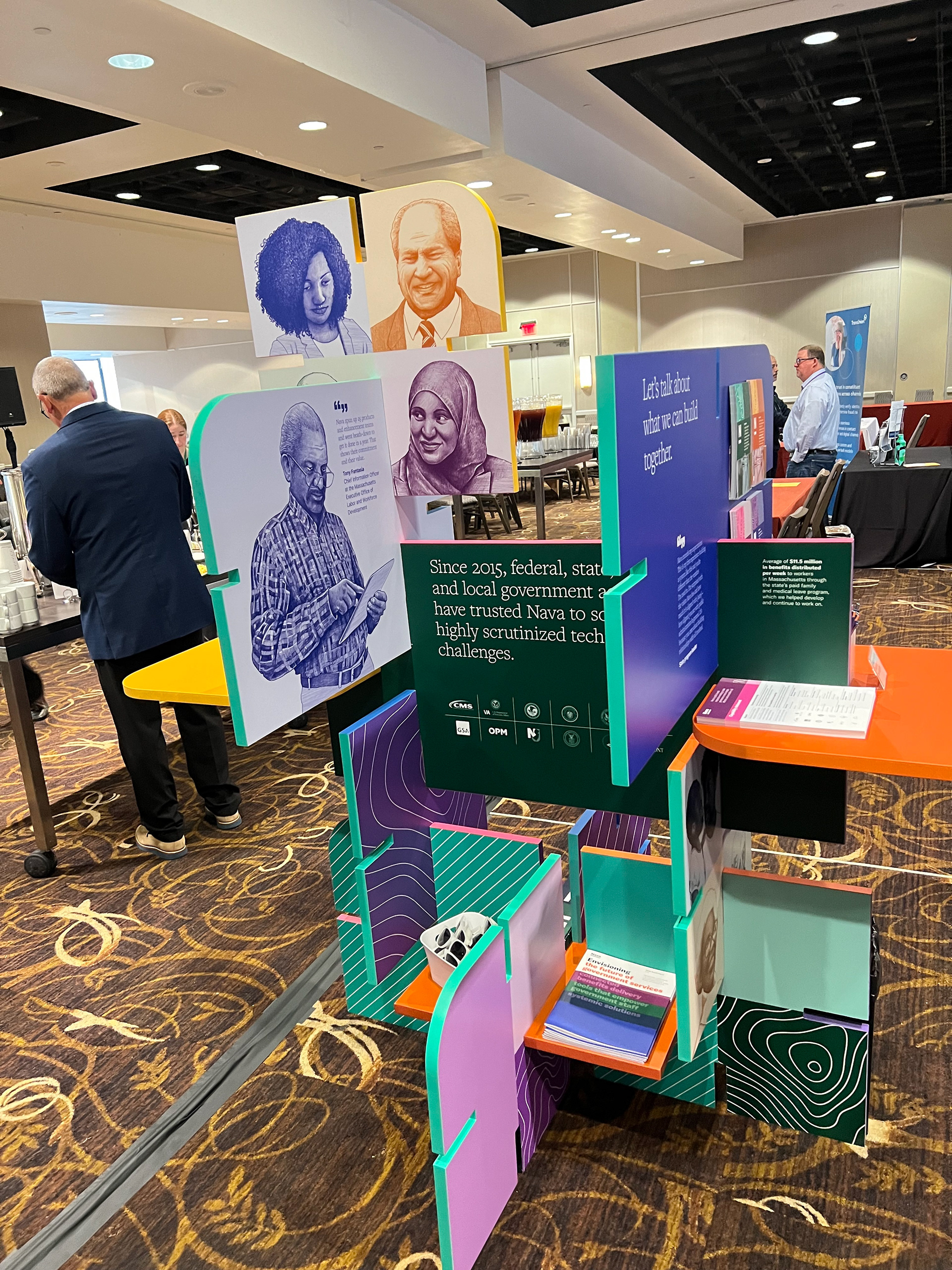
Three-dimensional sculpture for conference
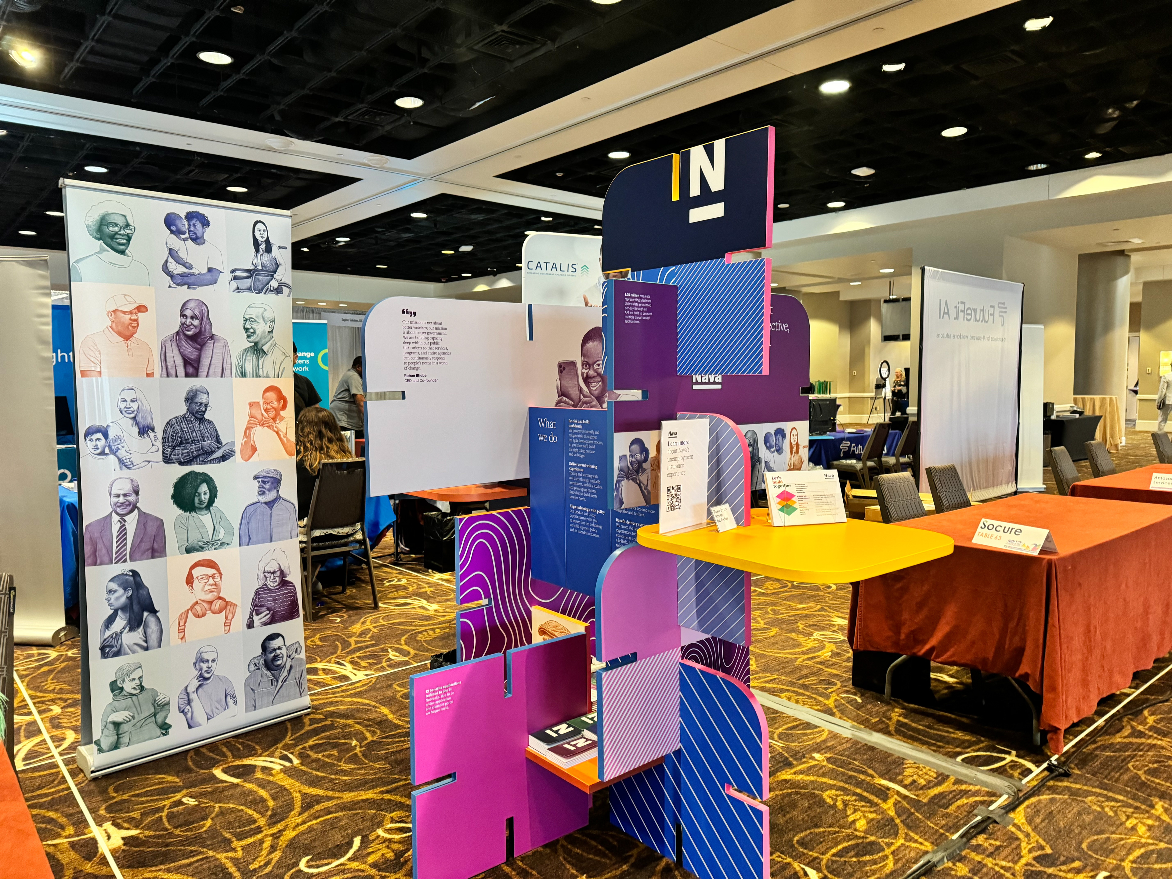
Three-dimensional sculpture for conference
Case study: Internal Newsletter
My role: Project manager, content strategist, researcher, designer
Team: Bob Wilkinson, Sr. Designer; Marques Webster, frontend developer
Tools: Mailchimp, Google Suite, Mural
Skills: Information architecture, audience analysis, user research, quantitative research and data analysis, content strategy
Platforms: Desktop web, mobile web
Intro: Through qualitative and quantitative research, I overhauled Nava's internal newsletter, greatly improving its readability, skimmability, and accessibility.
The problem: Previously, the Navagator was quite long and full of jargon that made it difficult for some employees to understand. This deterred people from reading the newsletter.
Process
I began by conducting an audit of our internal newsletter, conducting a company-wide survey to understand peoples’ experience with the newsletter, and leveraging Mailchimp analytics to gauge how people were interacting with the newsletter (similar to first-click testing).
I then put together a report that synthesized my research and made recommendations for how we could improve the newsletter's design, such as altering the typography, splitting the content into sections demarcated by a horizontal line, and adding a table of contents. Once I got buy-in from leadership, I worked with our communications designer and front end developer to implement the recommendations.
Outcome
6% increase in click rate since redesigning newsletter
18% increase in open rate since redesigning newsletter
The new version of the Navagator is much shorter, it’s highly skimmable, and it’s more accessible to folks across the company. Nava implemented several of our recommendations, such as adding a table of contents, altering the typography to be more accessible, leveraging color to differentiate sections of the newsletter, and using dividing lines to demarcate different sections.
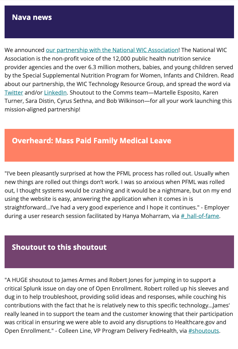
Before and after comparison of newsletter content and design
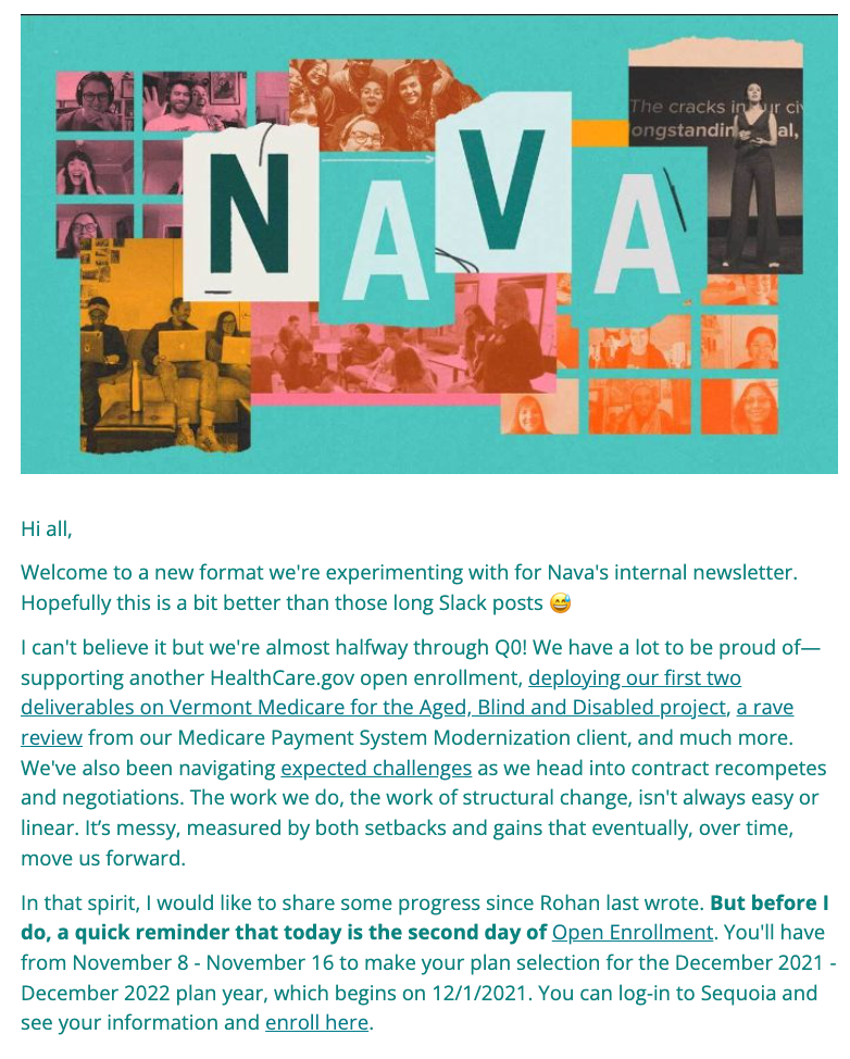
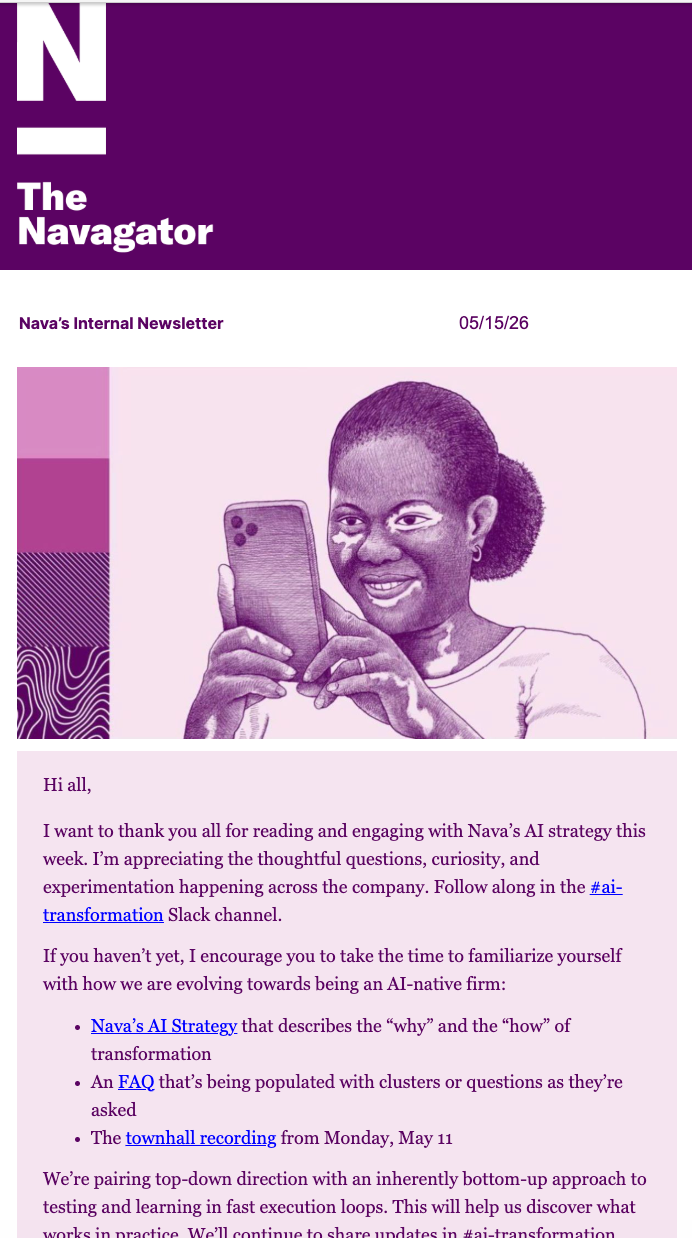
Newsletter before overhaul
Newsletter before overhaul
Newsletter after overhaul
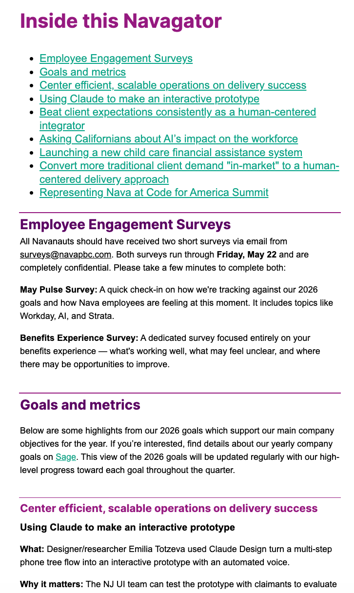
Newsletter after overhaul
Case study: Nava Public Benefit Report
My role: Project manager, content strategist, researcher, writer, editor, design consultant
Team: Bob Wilkinson, Sr. Designer; Marques Webster, frontend developer
Tools: Contentful CMS, Google Suite, Figma, Mural, Google Analytics
Skills: Competitive research, user research, information architecture, journey mapping, writing, editing, content strategy
Platforms: Desktop web, mobile web
Intro: Nava’s annual Public Benefit Report is an overview of key projects we worked on throughout the year. It enables us to share the outcomes of our work with prospective clients, and it helps talent understand what we do.
The challenge: Anecdotal feedback on the previous year’s report suggested that it was too long and full of jargon. Therefore, it was our goal to present users with a briefer overview of our work, with the opportunity to click out to more thorough case studies.
Additionally, we wanted to ensure that the flow throughout the report was usable, intuitive, and universally accessible with plain language.
Process
I began this work by reviewing key metrics from the previous year’s report — such as viewership and reader retention — and interviewing Nava’s program managers to gauge what projects to write about. I also partnered with our business development team and C-suite to ensure that the report would contribute to Nava’s goals.
From there, I built a concept note that contained audience user stories and proposed a report theme and chapter sub-themes. My prototype presented my idea for a highly skimmable report, where users could get an understanding of each story simply by reading the title, subhead, impact stats, and image caption. After gathering feedback on my prototype from the C-Suite, I was able to dive into the process of fleshing out the report structure and information hierarchy.
To write the report, I performed discovery research and interviewed over 50 members of Nava’s project teams. This enabled me to gain a holistic understanding of the work each team was doing. I then iterated on the content with our project teams to ensure accuracy and readability. Finally, I oversaw client approvals of all of the content.
In addition to overseeing the content of the report, I contributed my editorial expertise to the report's design, namely the content of the illustrations. I then sketched mockup illustrations to guide our contractor.
Outcomes
The final report received positive reception from stakeholders and contributed to increased traffic to our site.
20% increase in viewership compared to 2023 report
34% increase in engagement time compared to 2023 report
“I really wanted to thank Comms folks for a beautiful Public Benefit Report… What folks saw and experienced are polished printed materials, thoughtful web details, organized panels and remarks, and a tour de force of government leaders and speakers.” - Nava C-suite exec
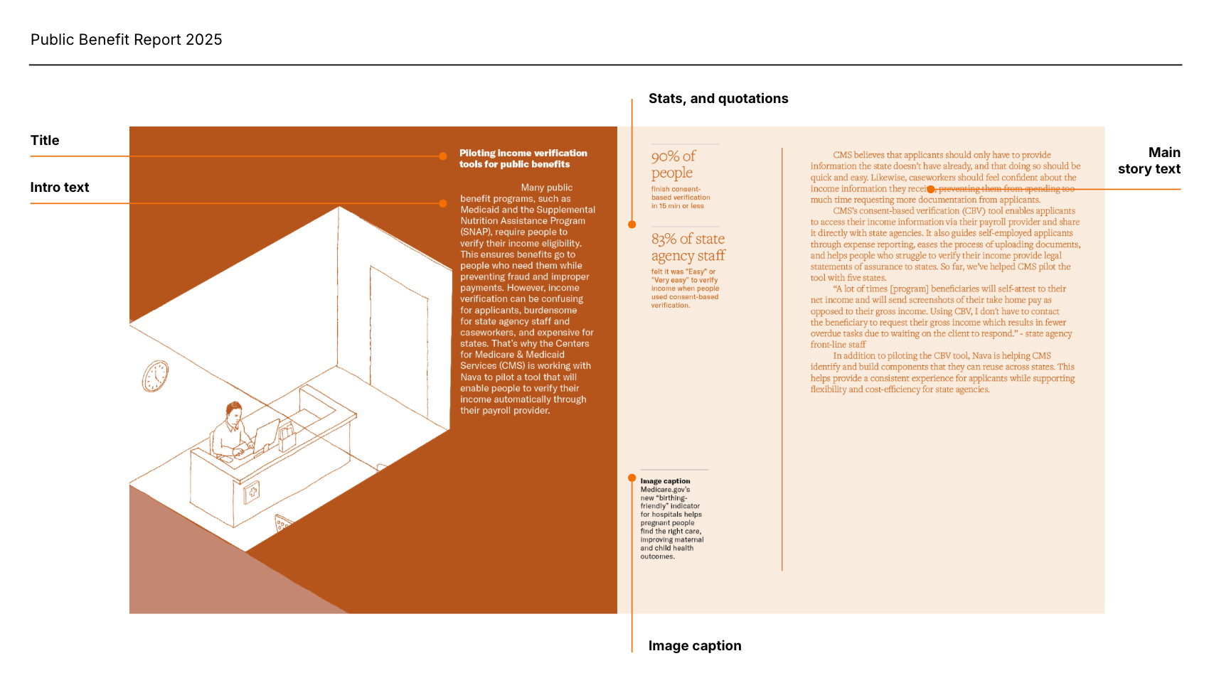
Screenshot of the report.
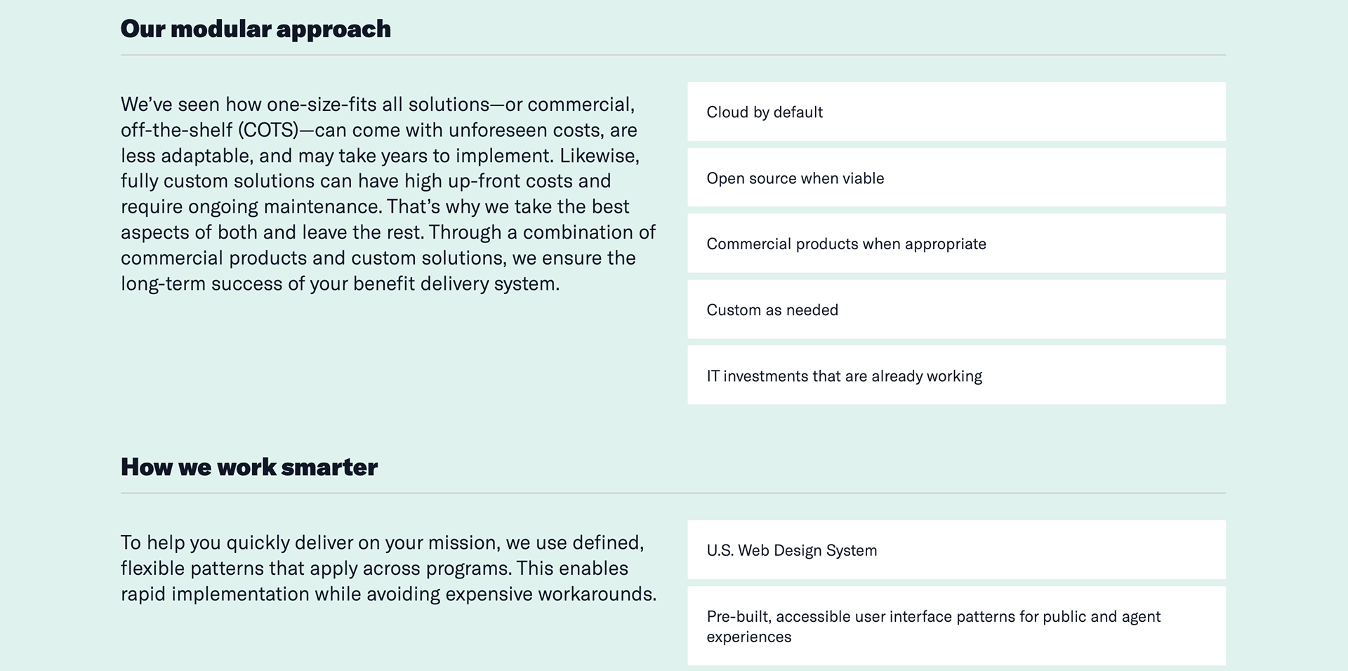
Case study: Benefit delivery systems page
My role: Project manager, content strategist, researcher, writer, editor
Tools: Contentful CMS, Google Suite, Mural, Google Analytics
Skills: Competitive research, information architecture, audience analysis, writing, editing, content strategy
Platforms: Desktop web, mobile web
Intro: This landing page gives an overview of Nava’s human-centered and modular approach to modernizing benefit delivery systems.
Problem
Nava’s business development team lacked an easy way to pitch our modernization approach to potential clients at conferences. They needed a one-stop-shop outlining our experience, approach, and the impact of our work.
Process
I met with the business development team to understand the ask and their needs. Then, I conducted a brainstorm to build out brand positioning statements for three key audiences — government procurement officers, government leaders, and government IT owners. Simultaneously, I conducted competitive research to understand how similar brands are tackling this problem. My research enabled me to put together a page table, which I iterated upon several times with the business development team.
Outcome
19% increase in clicks to our contact page after publishing benefit delivery landing page
The final landing page gives potential clients a thorough and accessible overview of Nava’s experience modernizing benefit delivery systems. The content and design are highly skimmable and accessible, and lead users to heed the call-to-action of meeting with our team for a consultation.
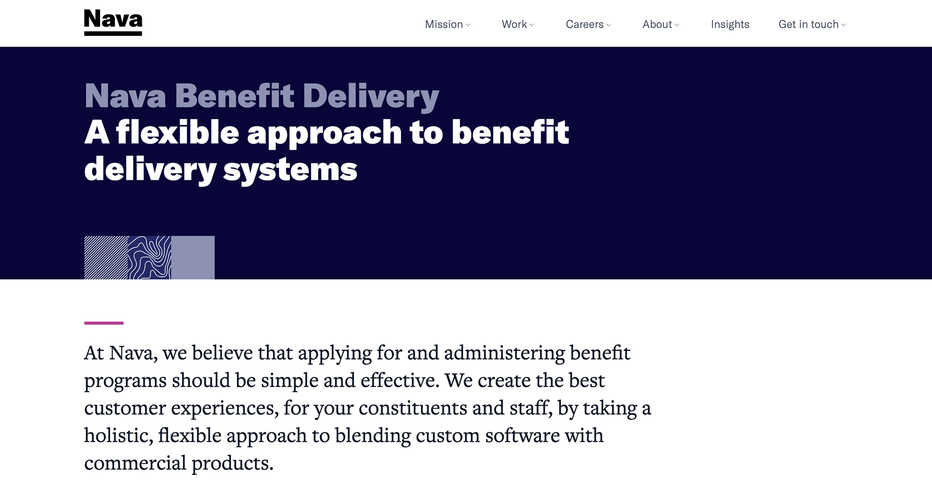
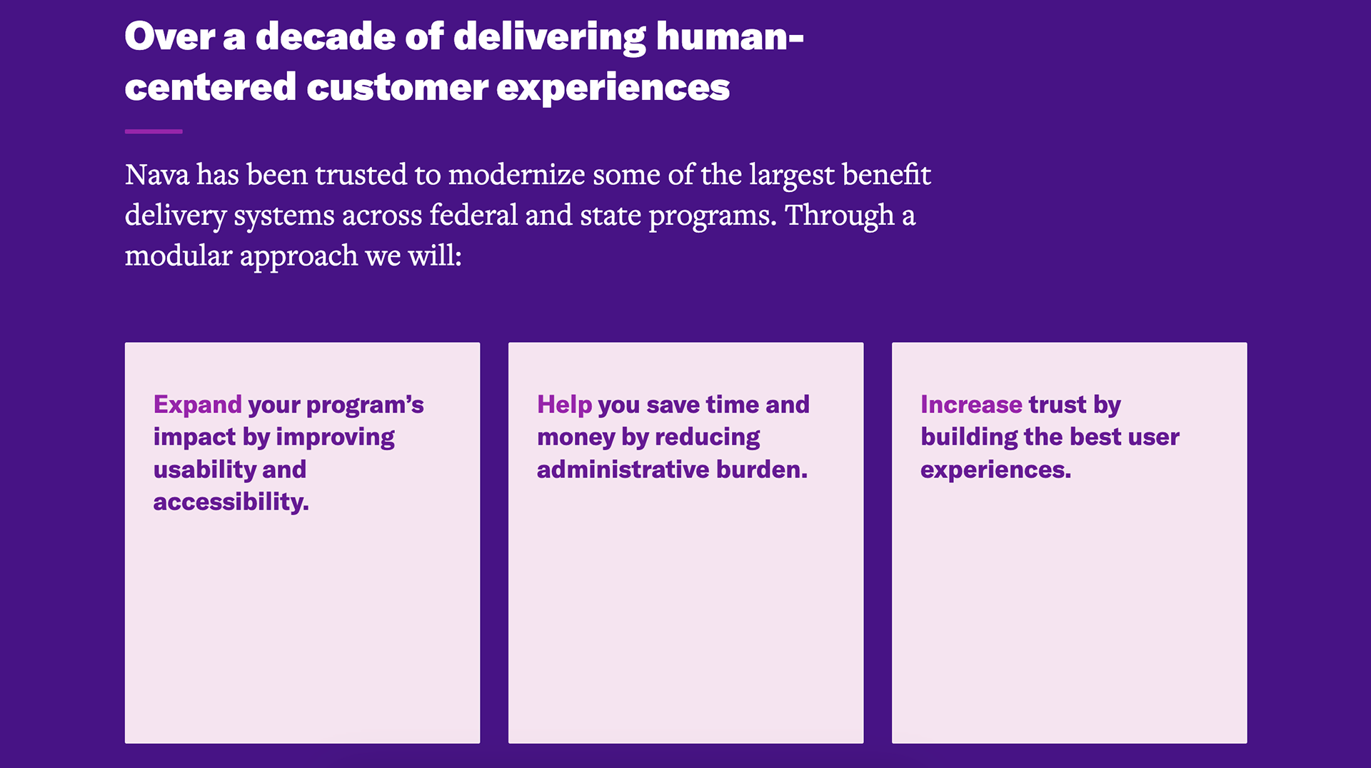
Screenshot of benefit delivery systems landing page. Design is not mine.
Screenshot of benefit delivery systems landing page. Design is not mine.
Email: keleadholm@gmail.com